Designing and documenting a design system for WeWork’s internal business tools

Project
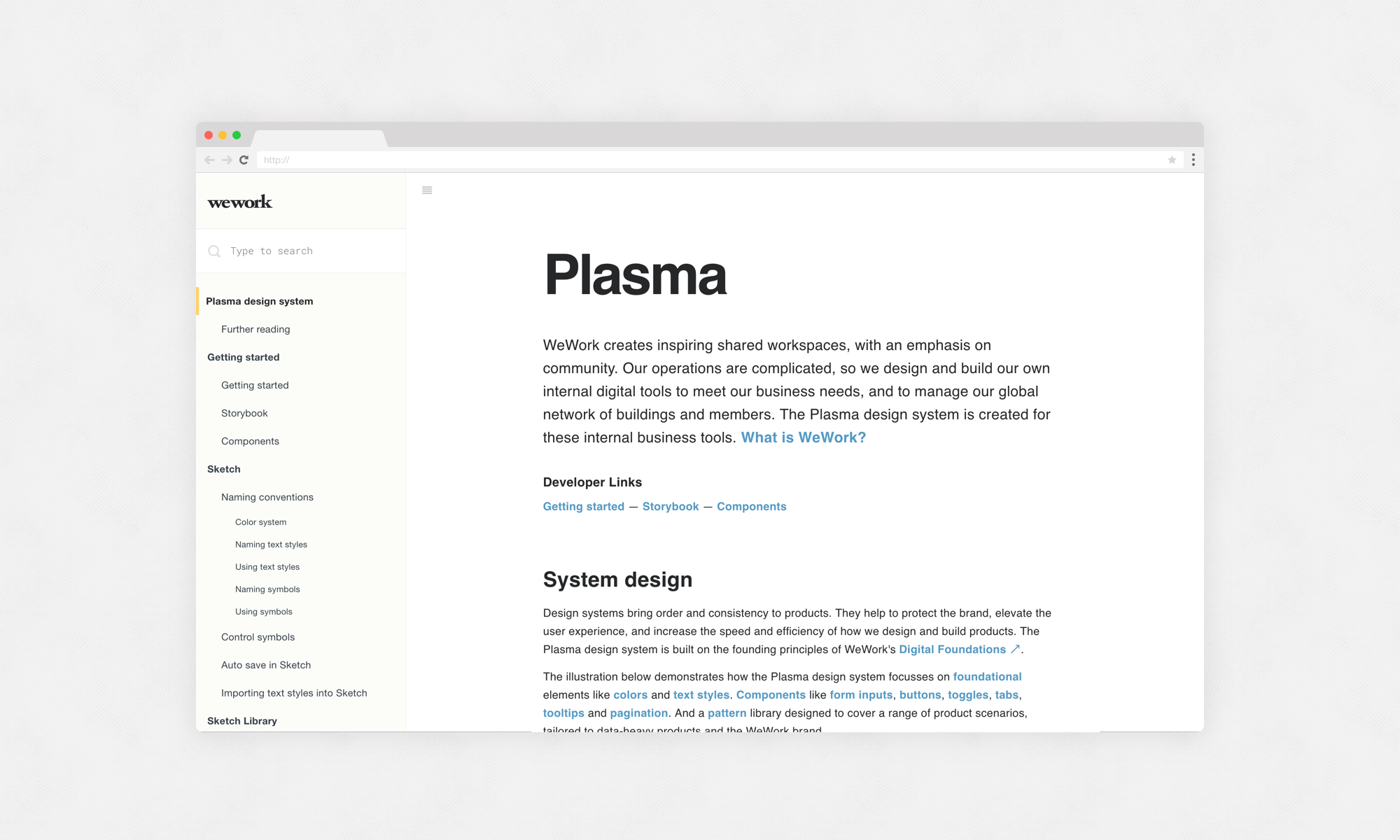
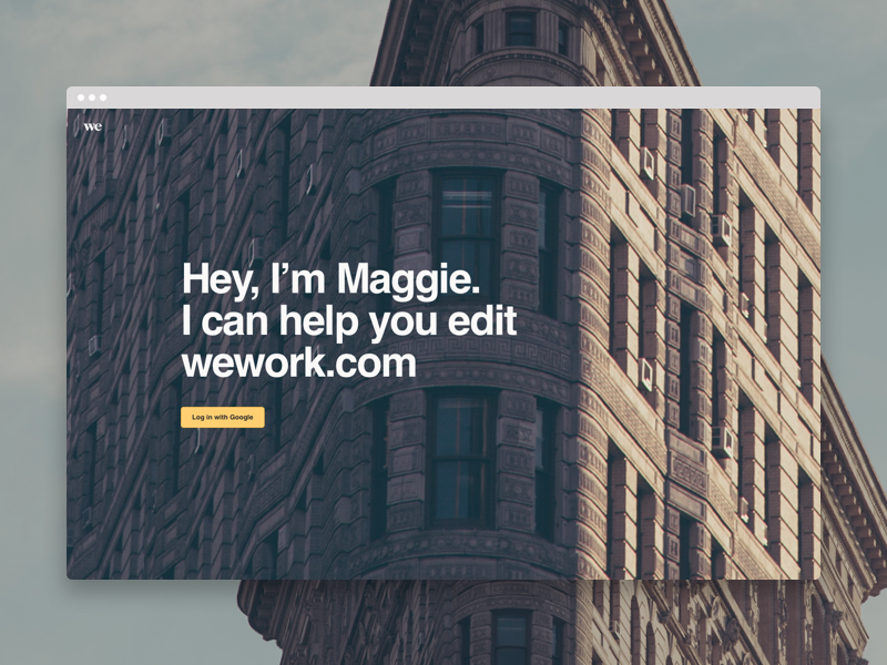
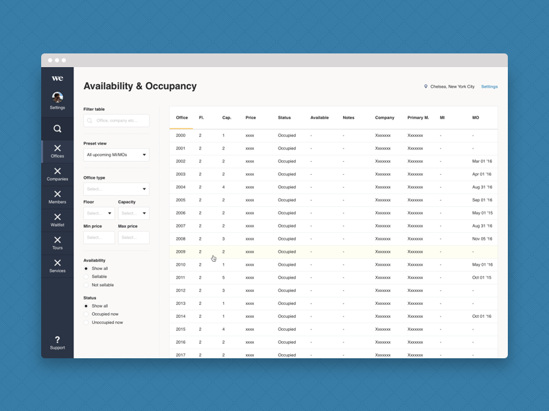
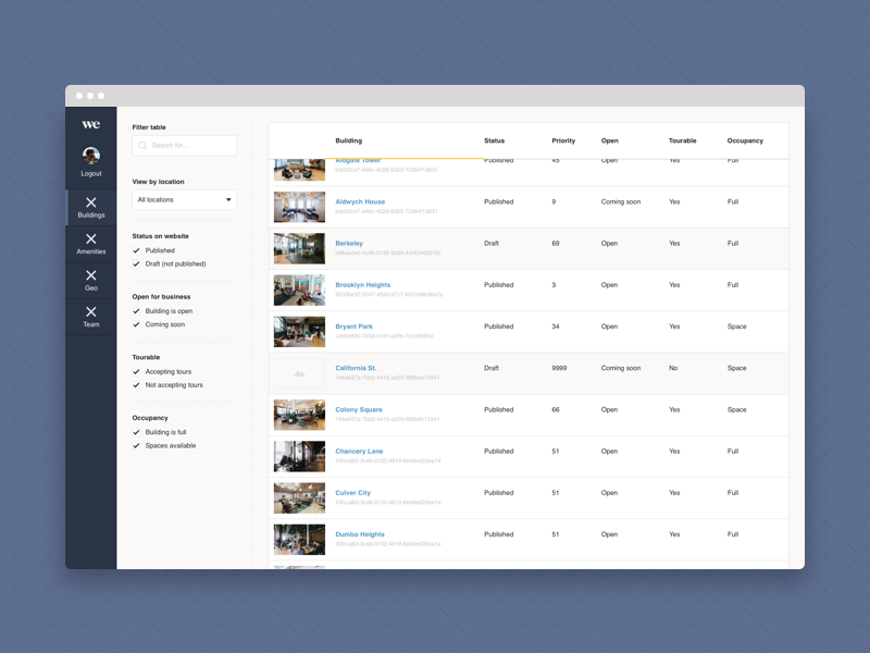
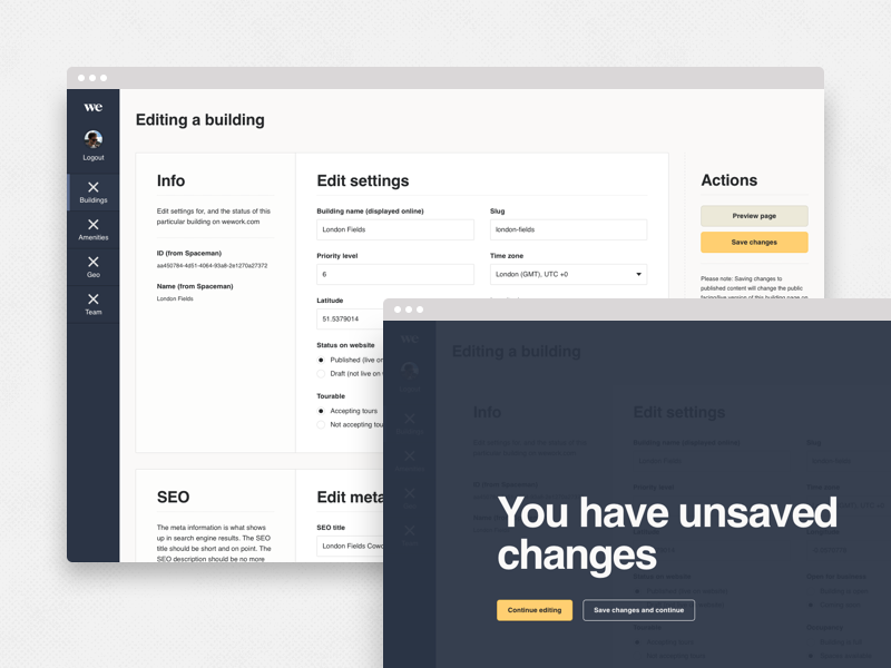
Plasma is a design system for WeWork's internal business tools, used to manage the company's global network of buildings and community of members. It was my job to design and creatively direct the creation and documentation of the design system.
Process
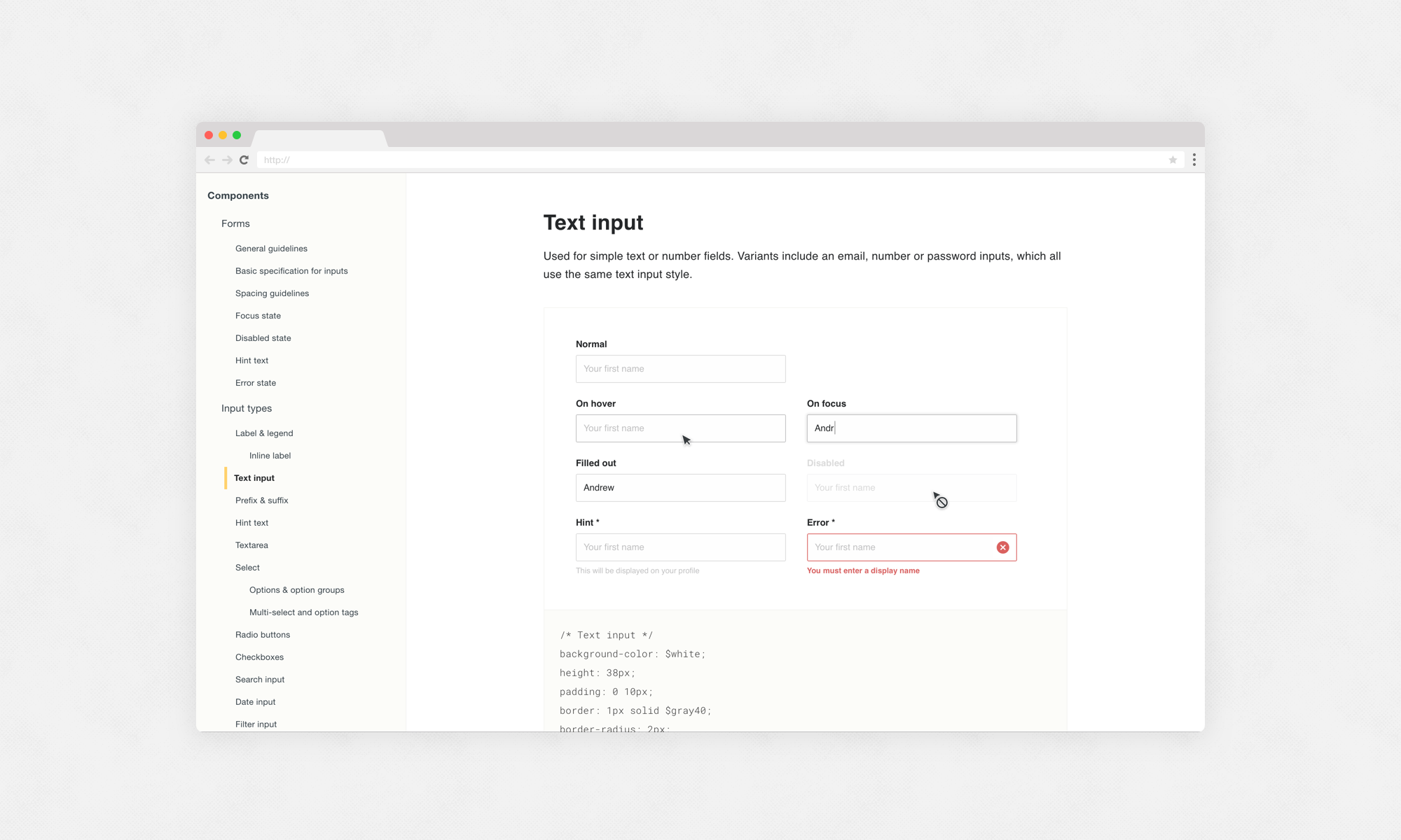
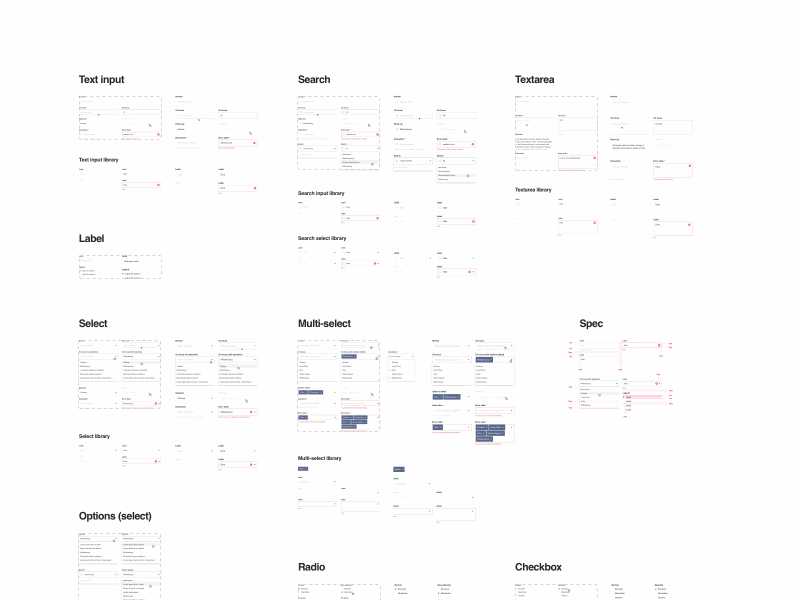
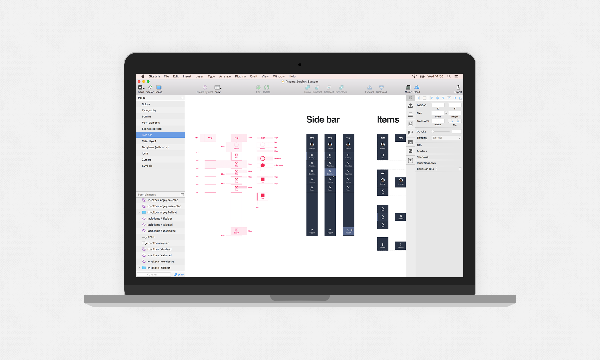
I started out experimenting with three different internal products that the system would be applied to, discovering, establishing, and stress-testing a style and library of components and patterns. Later in the process, I created an adaptive/responsive library of UI components, synced and made available to a team of designers via Sketch Library. This allowed the team of product designers to quickly construct UIs and flows using consistent pre-made, editable, and flexible Sketch symbols, so they could focus on UX, and not re-designing the product over and over.
Every detail of the system's design was documented, initially (for speed) using Google Docs so it was easily accessible by the team, and later developed into a website. And the implementation/development of the system was tracked via GitHub between myself and the engineering lead, built using React JS and Sass, including integrating CSS/Sass I had written while designing and documenting the system components.
Below is a taster of the design system and the Sketch Library of components. Read a more in-depth design case study about this project here.
Involvement
System design lead
Lead product designer
Creative director
Client
Date
2016
Credits
Nick Stamas — Engineering lead
Deena Edwards — Product designer