Home page
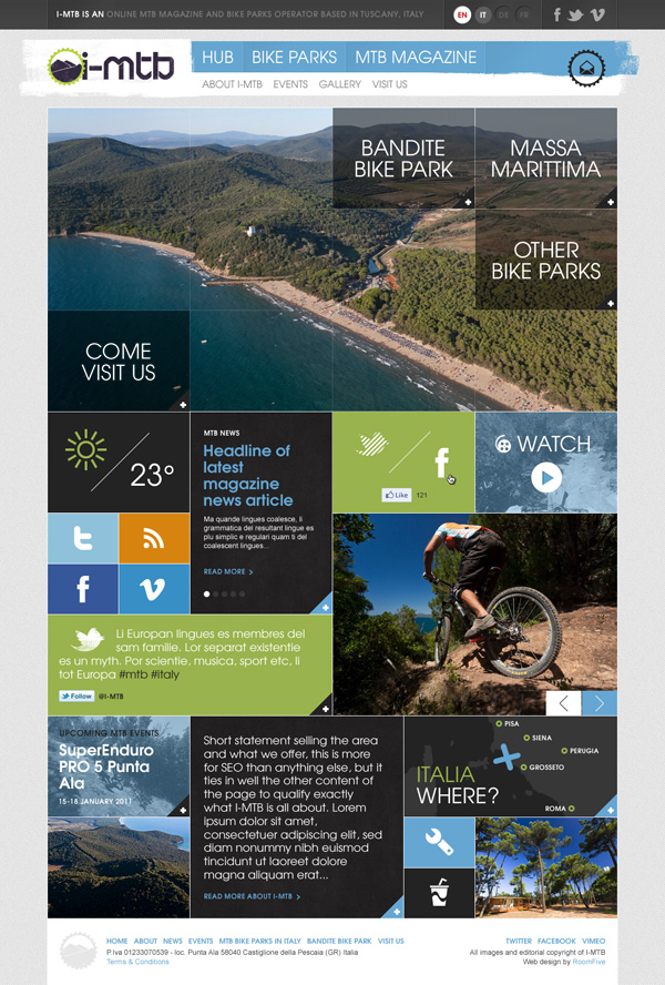
A very visually lead home page shows off the stunning scenery around the clients' primary bike park in Tuscany, Italy, mixed with plenty of action riding shots. The rest of the grid is made up of useful information like a live local weather feed, latest news, social links, upcoming events etc...
Grid
The design and all templates follow a tight grid, which is flexible over the different templates for interest and variety. Grid 'modules' (e.g. navigation, cross-sells, latest news etc...) can be inserted anywhere on the site to suit different scenarios and content flows.
Psst.
I designed this long before the Windows phone interface came out, I know there are similarities! ;)

Live weather feed
Using a local weather station feed (via Yahoo). I had to artwork 47 icons to match every weather scenario the feed outputs... To create an 'at a glance' forecast (hopefully) to communicate the typically good weather in Tuscany, Italy.

Social
A simple idea for including a Facebook Like Button and Twitter Follow Button in the same space, so the user can follow I-MTB's social accounts without leaving the site. A bit of jQuery switches out the content on-click of the icons.
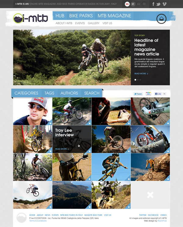
Magazine
Essentially a blog archive with feature stories… The articles can be filtered via a dropdown menu of categories and tags.
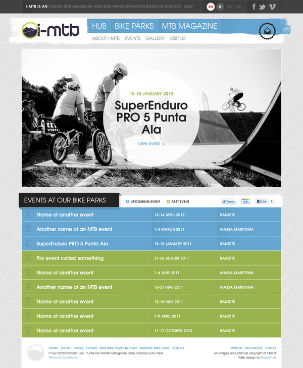
Events
Clearly showcases upcoming and past events. Within the list, the blue represents upcoming events, the green: past events. The next event (or the event they want to push the most) can be pulled out as a featured panel at the top.
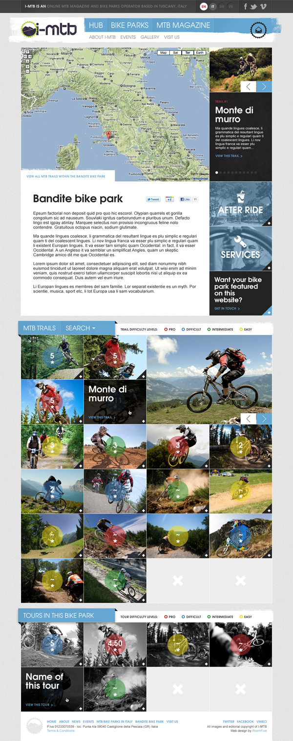
Bike park
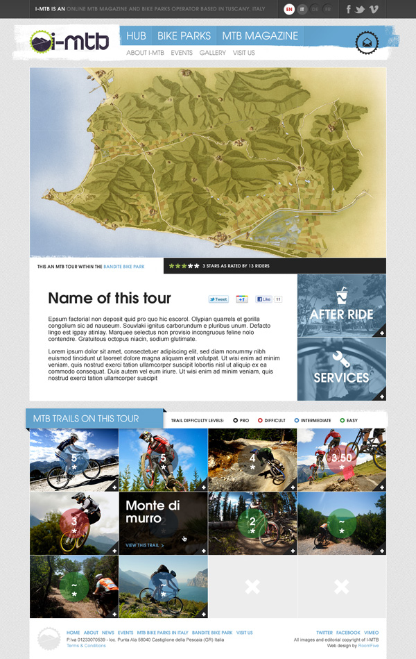
Each bike park has an overview page, introducing it, it's location and showcasing all it's trails and tours, with links to 'After Ride' and 'Services' available at each bike park (pre and post ride). Each trail and tour is clearly colour coded by it's level of difficulty, sorted by highest to lowest rated (5 star user rated).

Rating & Difficulty
In the grid view the trail ratings and difficulty come together. The colours represent the level of difficulty (there is a key to this colour system) and the number represents the user given average score of 1-5.
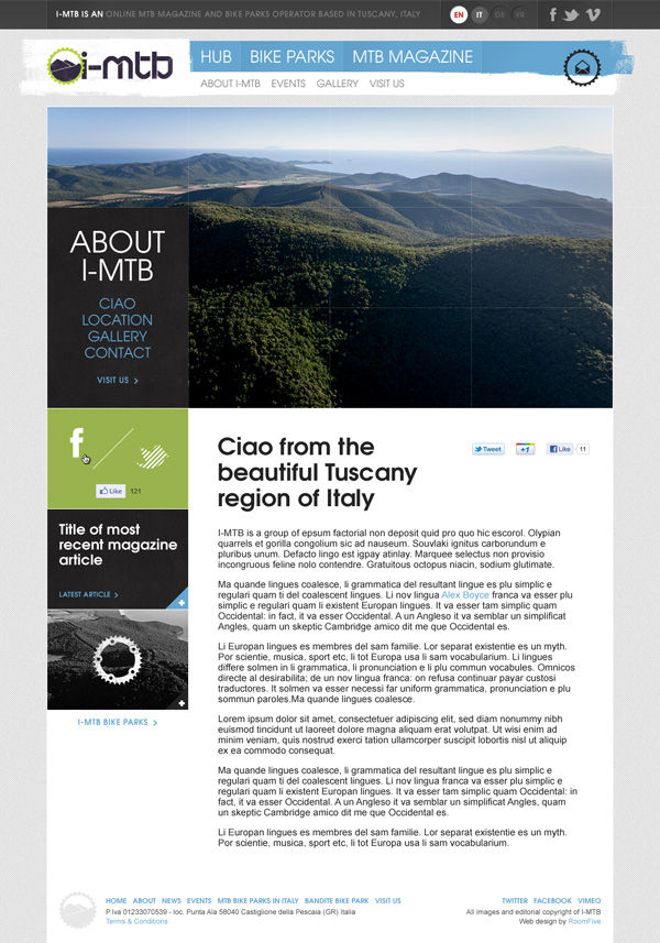
Generic template
A text orientated template to cover a number of pages throughout the site.
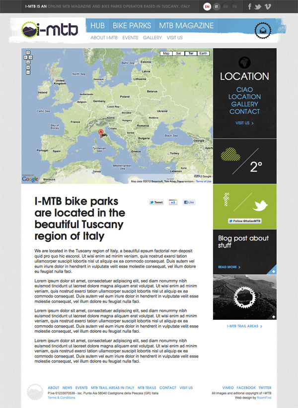
Location
Relative to Europe, for riders who travel to the region.
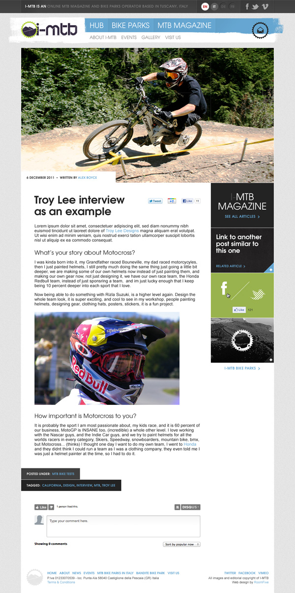
Article template
Template for a magazine (blog) post.
Icons
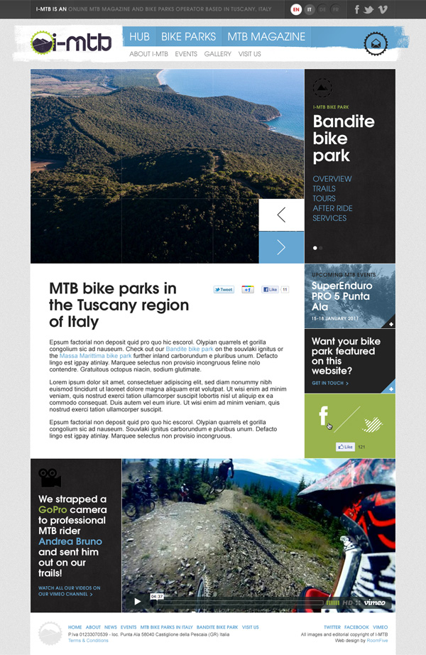
Bike parks overview
Introduces all the Italian bike parks I-MTB operate.
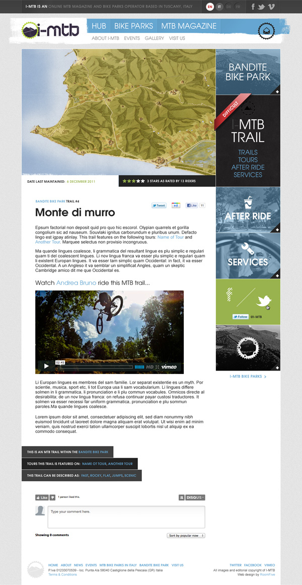
Trail
A template to showcase a bike trail, including a map plotting the route, a run through of the trail including videos and photos. Each trail is ranked by how difficult it is and the user can rate each trail from 1 to 5 stars. There are numerous cross-sells throughout the website to sell the different bike park services and to book accommodation / get in touch.
Difficulty
The trails and tours are clearly labeled by their level of difficulty, from suitable for pro MTB riders down to family friendly trails.

Rating trails

Tours
Each bike park has tours that are made up of a number of bike trails. These can be created in the back-end by the client and are made up of any number of existing trails on the site.
Wireframes
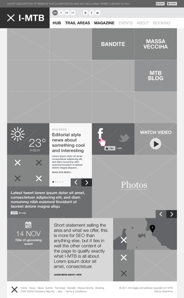
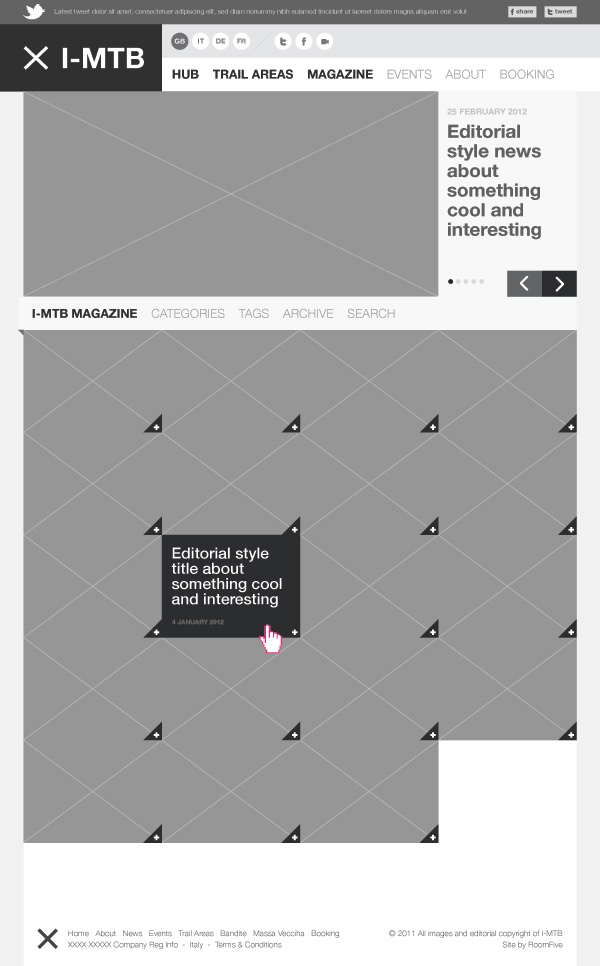
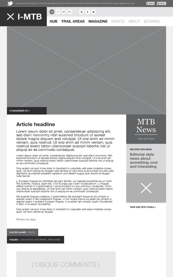
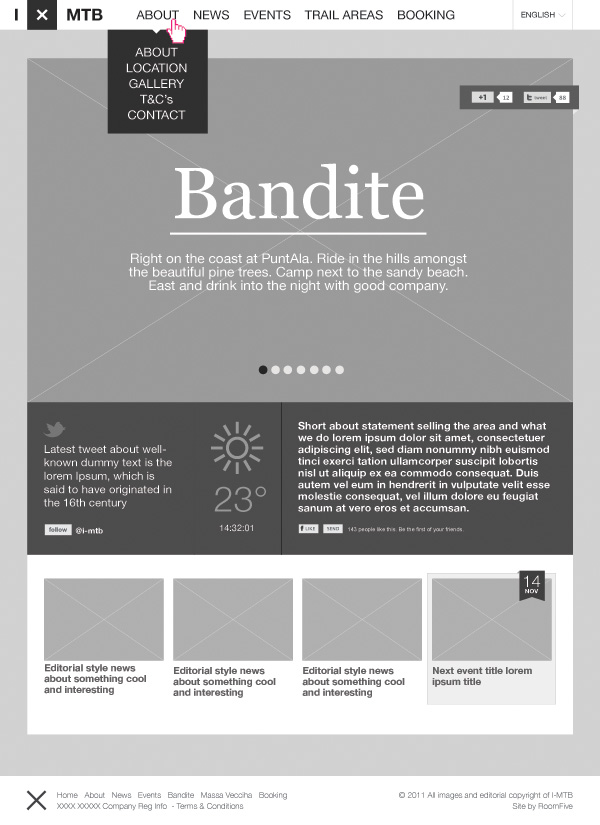
A few of the wireframes I created to sign-off the idea and layout with the client, pre-design in Photoshop.
