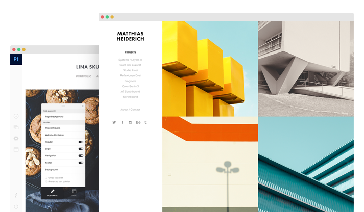
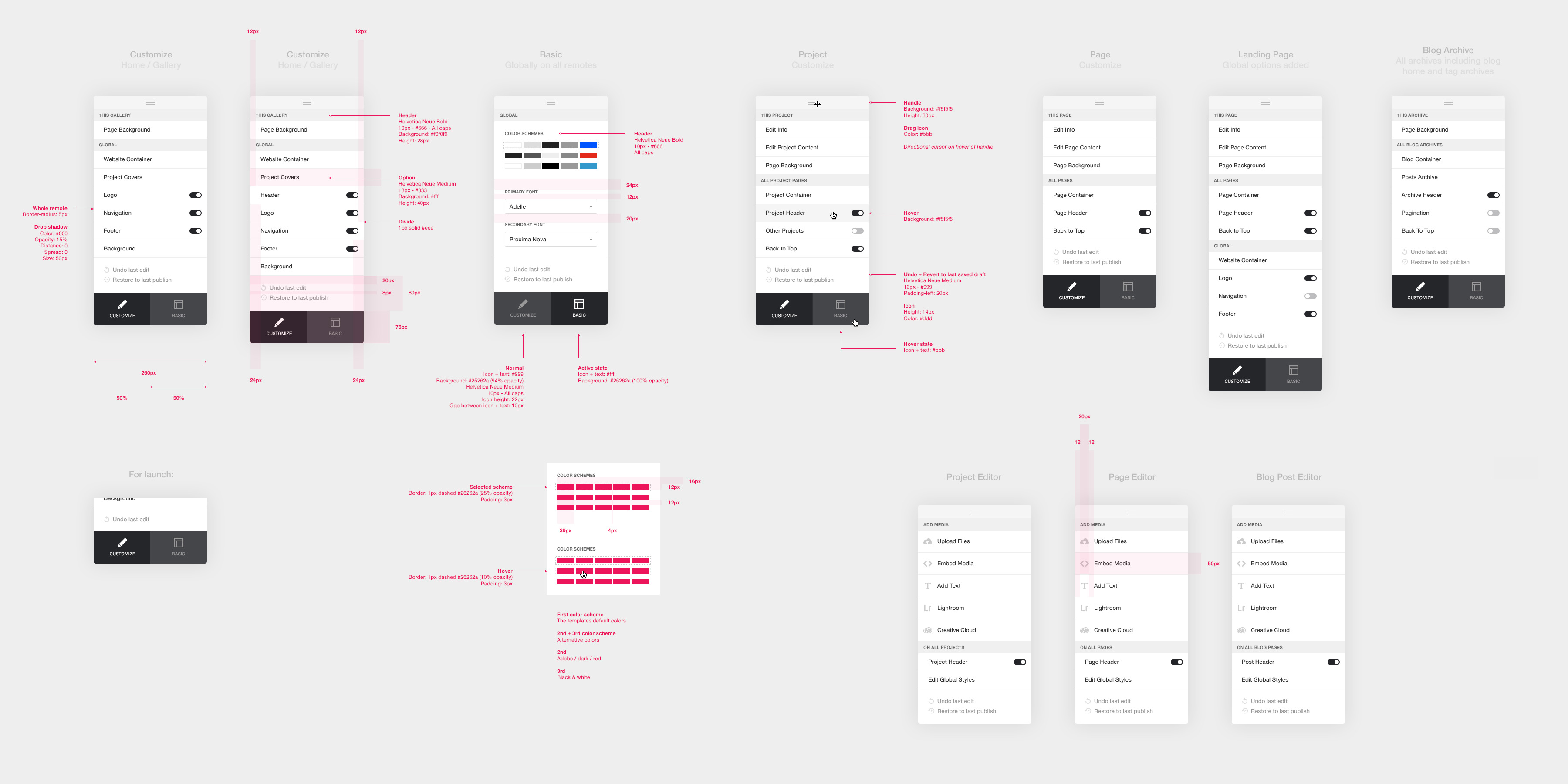
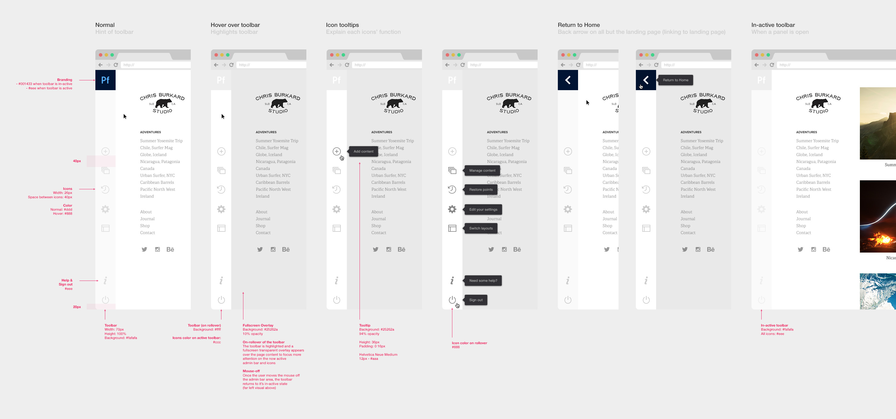
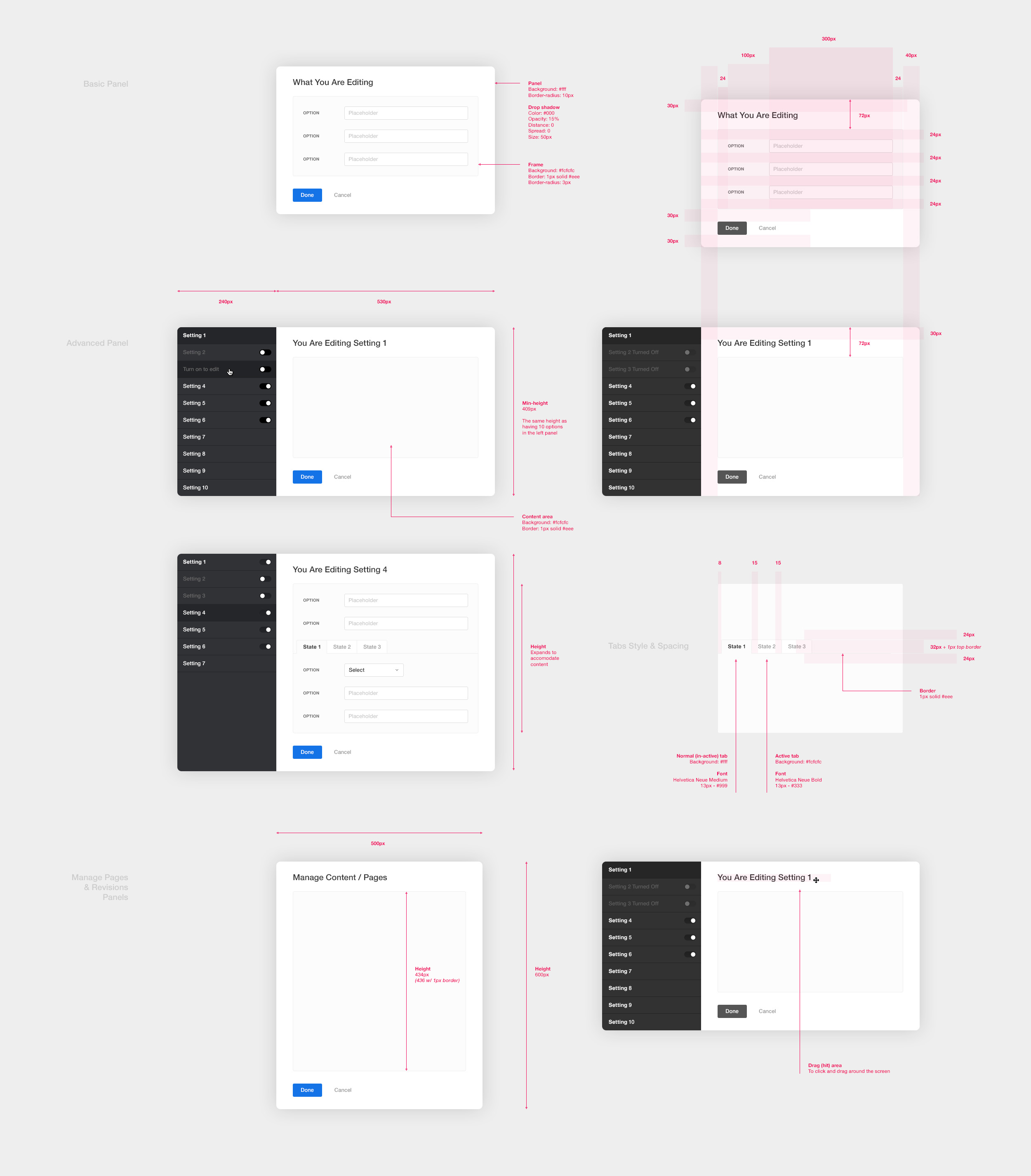
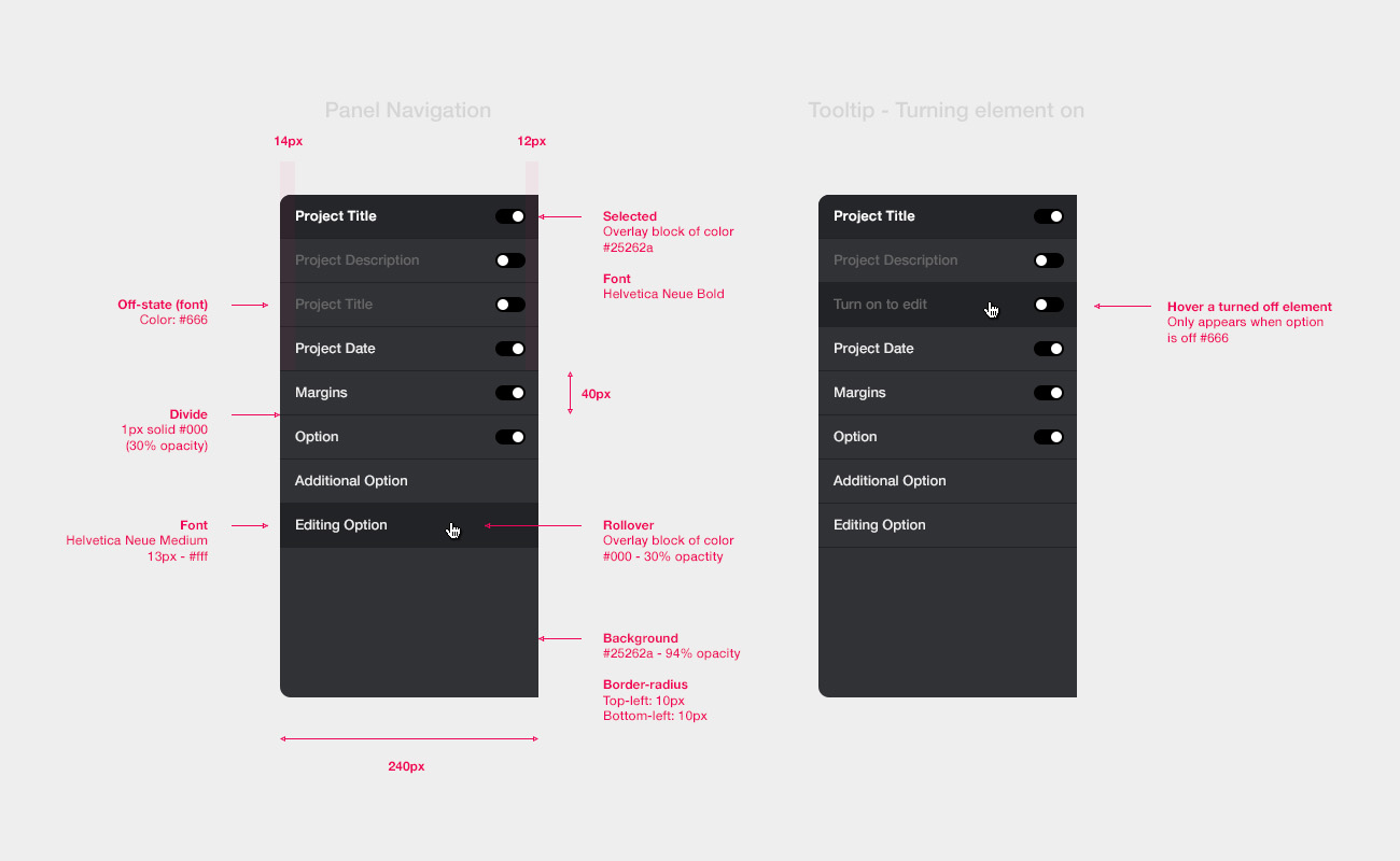
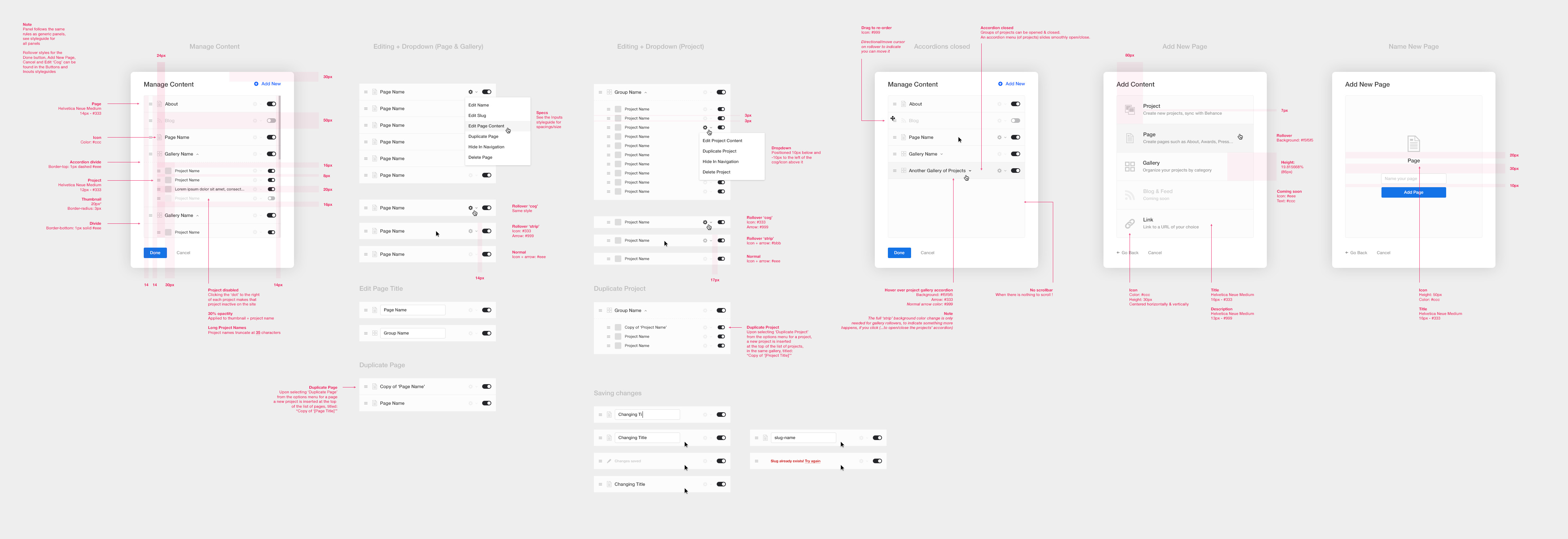
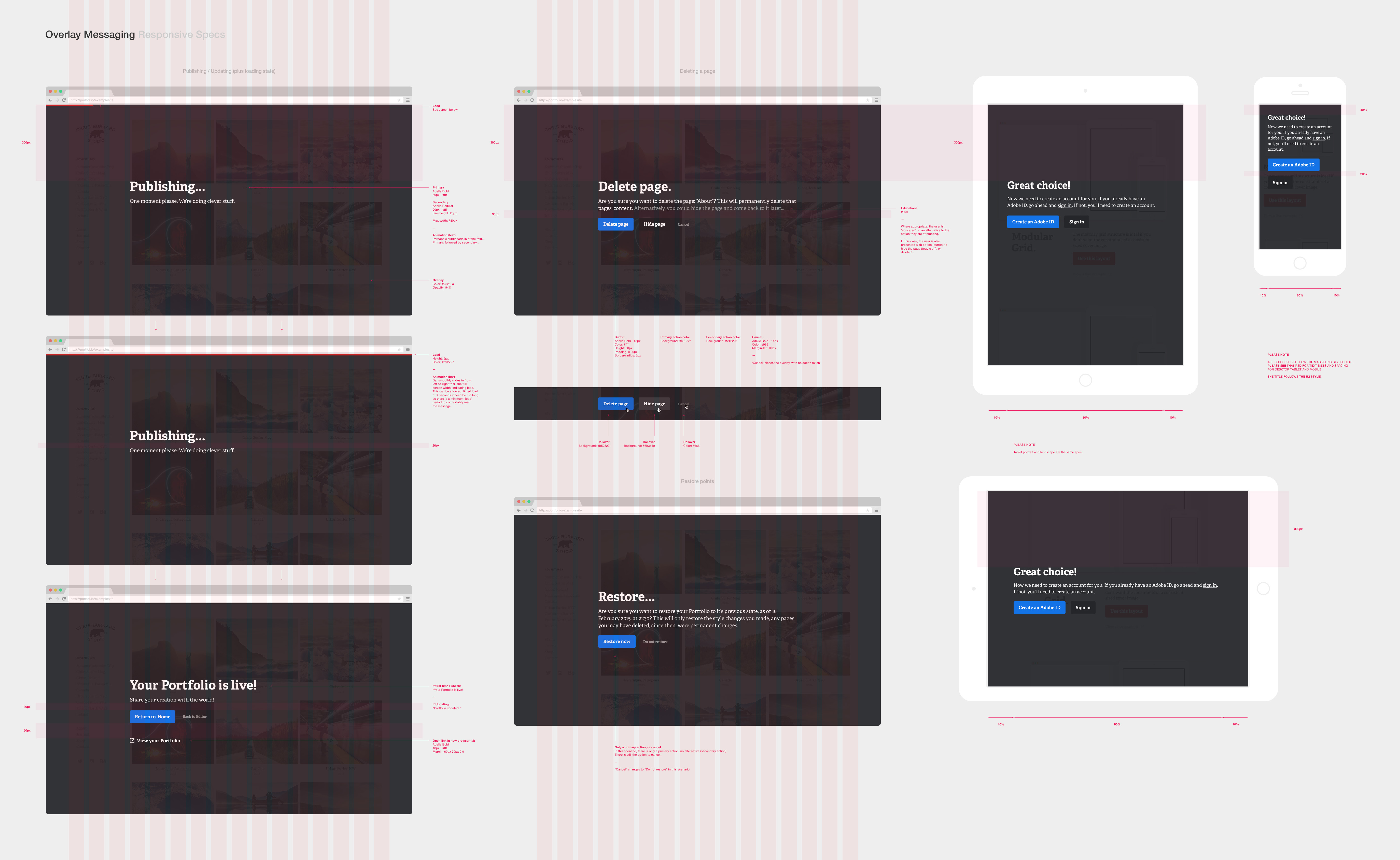
Showcased here is a small sampling of the detailed specs for all the UI components and features of the Adobe Portfolio editor. All done to explore and document the UX, and used by the developers to build the product. The specs aim to cover all scenarios, from rollover states, to errors, active/inactive states etc…, and also cover px values and dimensions (I even go as far as including basic CSS).
I wrote a design case study article giving insight into my design process over a year in creating the Adobe Portfolio product, marketing and brand. Hope you find it interesting.
Read my article
Lead product designer
User experience (UX)
Creative director
2015 - 2016
Nominated for a Webby Award
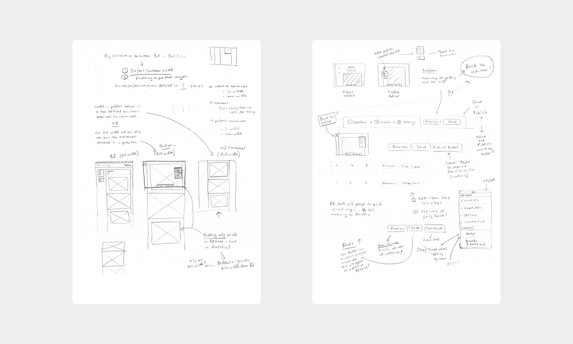
Writing and sketching really helps me to focus, and ideas flow from there. Sometimes I simply write words I associate with the product, or list what it needs to do, just to get it out of my head. It helps to un-clutter the mind and focus on what’s important.
This sketchbook work naturally evolves into UI sketches. Sometimes I’ll sketch a feature, or a small UI detail, or a new approach to the UI entirely. It’s a quick way of purely and simply just designing and exploring ideas. Perhaps most importantly, you don’t get distracted by pixel perfection, fonts, colour, grids, guides etc… like you do while using computer software.
The above two specs document two of the main routes to editing and customising much of the content in the editor, beside direct access of all elements. The specs cover all states and scenarios.
There are literally hundreds of the panels above designed for every possible editing scenario in the product. The panels above show just panels to edit the navigation. These are used by the developers to build out the product, and are also important when designing how a feature is customised, ensuring all angles are covered.
Direct access, the remote, toolbar and ultimately the panels — the Manage Content panel shown documented above is one of the main points of editing. From here, new content can be added, and existing content can edited, reordered, renamed, duplicated, deleted and more.
Fullscreen overlays takeover the screen when there are important messages or actionable things — these range from warnings, to onboarding and educational messages. The language is used is always 'human', friendly and down-to-earth, with simple options to continue based on the users preference.
A simple one point of entry to edit an existing projects' information, from the title and slug, through to settings specific to the Behance Network (if you've chosen to also sync your project to Behance). There are similar to panels to this tailored to creating a project also, but these panels above are for editing an existing project.
The three sets of panels above all show various scenarios for editing images. Images uploaded as project covers or background covers can be resized and cropped in the editor. Background images have most of the options available to the user as if they were editing the CSS themselves. The third panel(s) in the series (above) shows an awesome feature of the product whereby the aspect ratio of all project covers can be changed and all covers auto-cropped to account for the change.
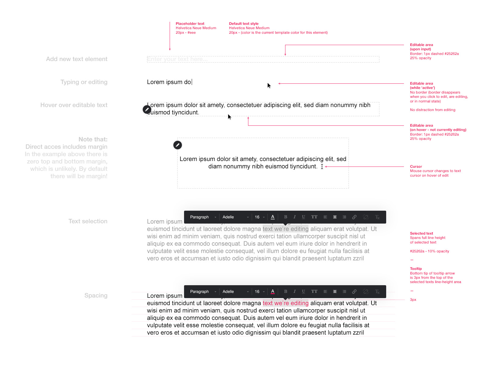
The text editor is arguably (technically) one of the most complicated parts of the product, but the design and user experience should be as simple as possible. We wanted as minimal, distraction free editing as possible, so you can focus on writing.
Below are all the inputs, selects, buttons and toggles in the product, including all their states. These are important for both the front-end development of the product, and as a UI toolkit that is used for constructing all design mockups and prototypes, ensuring all elements are consistent.