Designing a dashboard to manage a white-label fundraising product
Context
In 2013, I was a product designer at a startup in London that built tools for charities (learn more here). Working closely with the two founders of the startup, we iterated on concepts for all sorts of things we either thought charities would benefit from or that charities had told us they would use if we built it.
Project
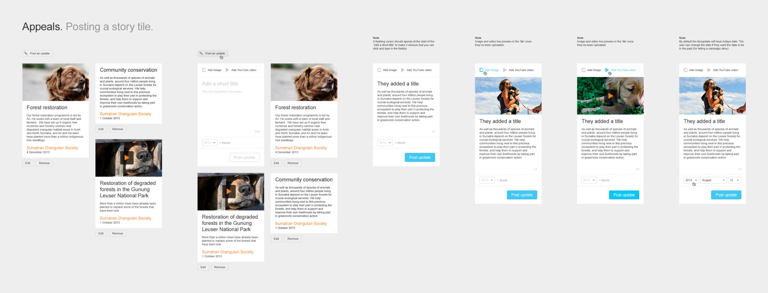
This particular project was the B2B side of the business. Our clients were charities and the end product the public sees was a suite of fundraising initiatives from simple donations to fundraisers, appeals, campaigns, and more. The charities needed a way to manage and customize these white-label initiatives. The product also served as a means for the client to manage their account and upgrade to unlock new features. This back-of-house product underwent countless redesigns and iterations over a 2-year period as we worked with charity partners to build the most useful product.
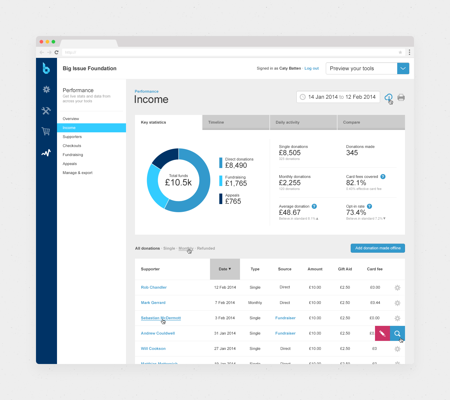
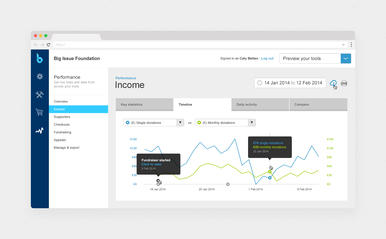
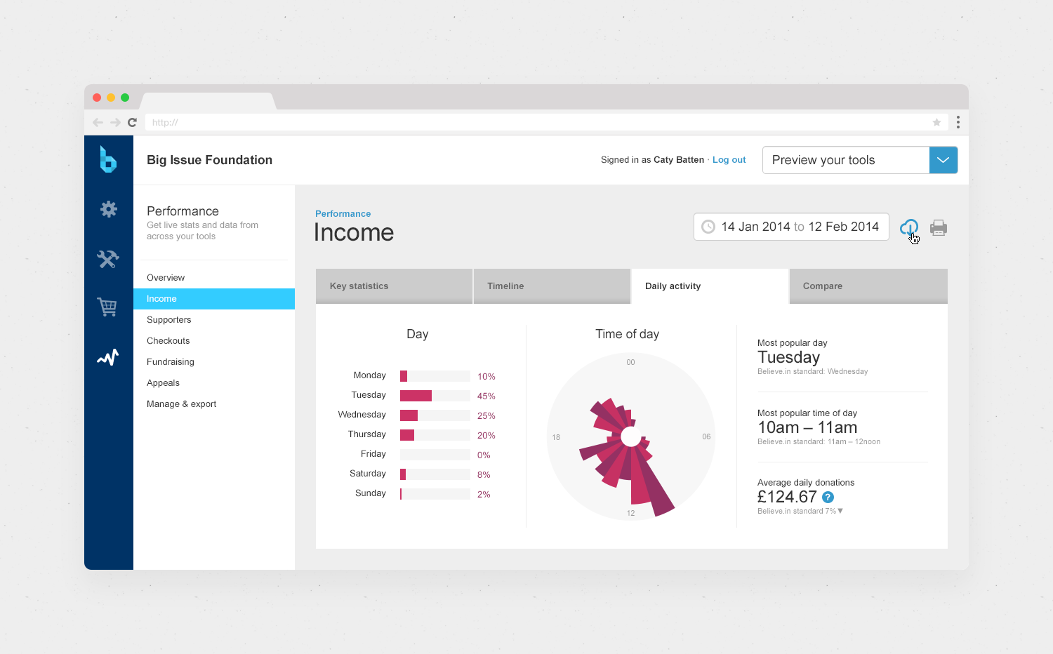
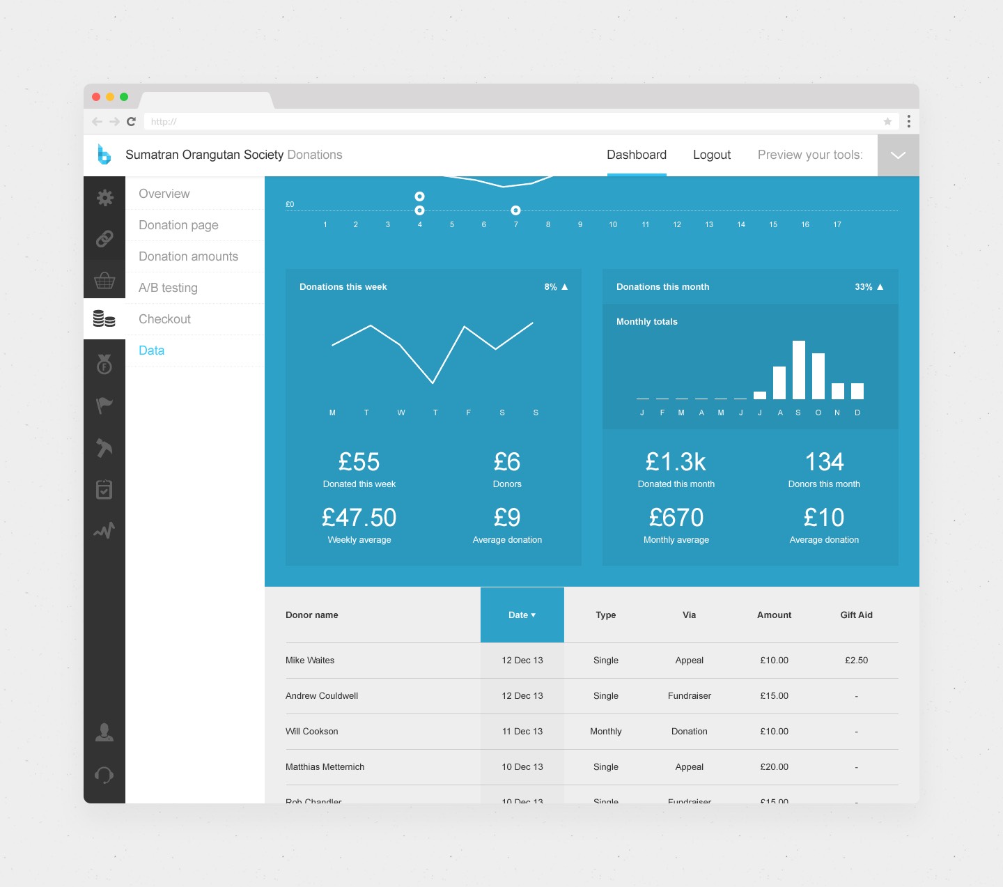
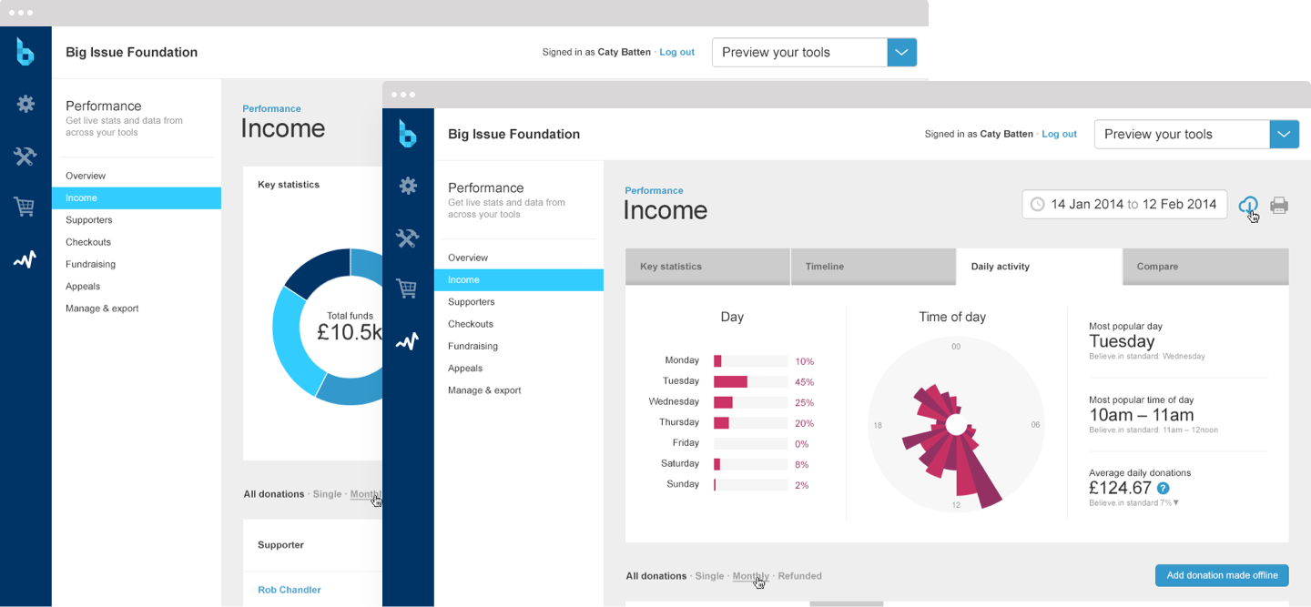
This was a fun project in that we experimented with lots of data viz elements and in general, our aim was to create not just a comprehensive and useful dashboard, but a visually engaging experience too. It was also challenging in that we needed to accommodate a lot of charity feedback and feature requests while being realistic about what we could build in such a short period (being a startup). Shown below is just the tip of the iceberg, including deviations in layout, features, and styles as we iterated.
Involvement
Concept
Product Design Lead
Client
Date
2013 - 2014
Credits
Will Cookson and Matthias Metternich, the Founders of Believe.in, who I worked closely with on this project