In 2013, I was a product designer at a startup in London that built tools for charities (learn more here). Working closely with the two founders of the startup, we created a suite of customisable and white-label fundraising tools, exclusively for charities, including public responsive web pages and a comprehensive charity-facing dashboard.
Seen here are just some of the many iterations of the B2C, public-facing elements of the business. White-label web templates that charities could customise and share with their supporters. This product saved charities millions in design and development costs, which was especially great for smaller charities that don't have the budget to hire outside help or build their own bespoke campaigns.
Some charities, events, and photography represented in the visuals below are for concept purposes only, to show the potential of the tools. The charities, Surfers Against Sewage and VSO (seen below) were actual users of the Believe.in product.
Creative director
Concept
Design
2014
Will Cookson and Matthias Metternich, the Founders of Believe.in, who I worked closely with on this project
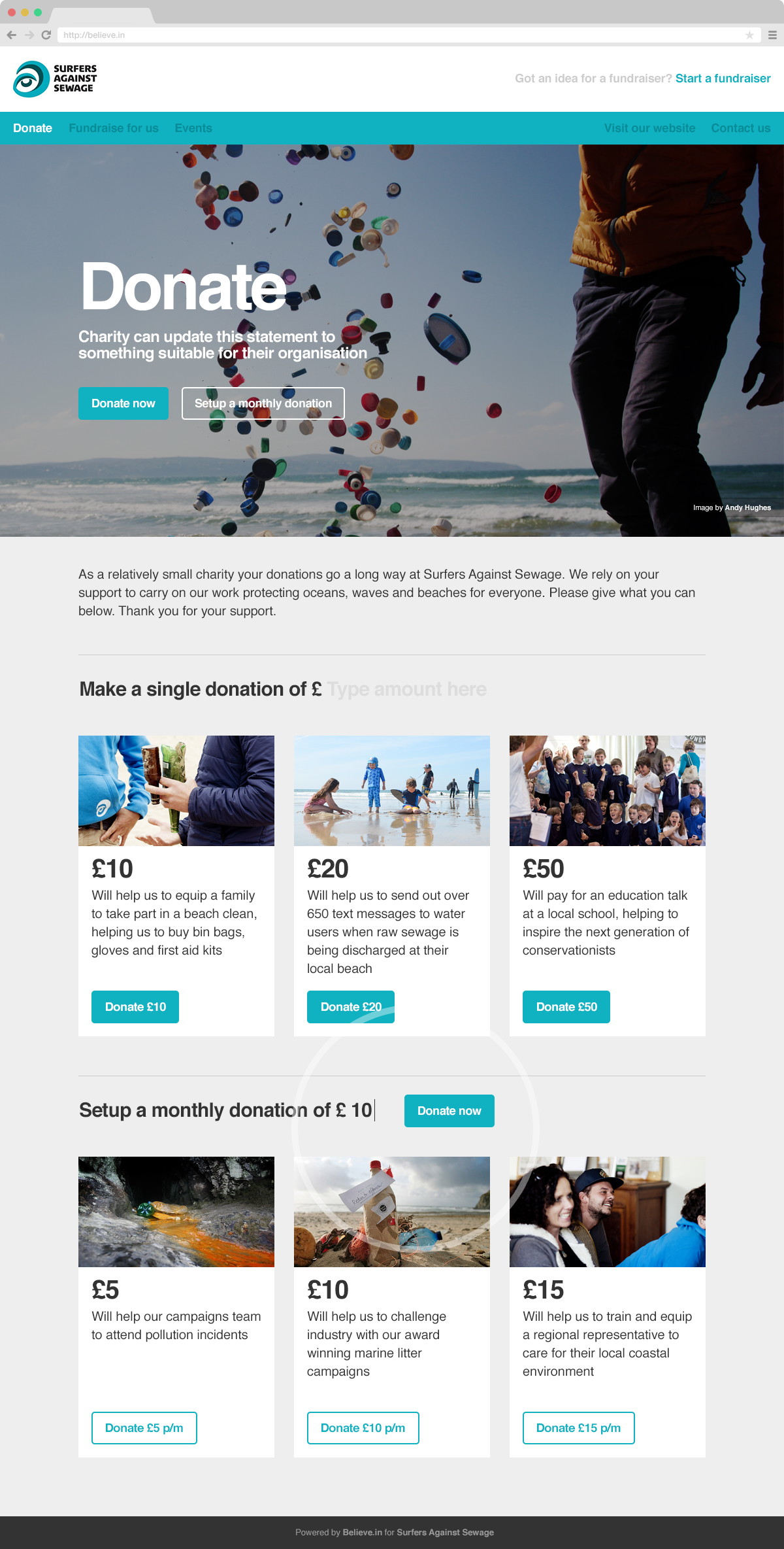
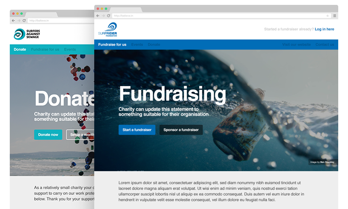
A very simple, beautiful, bold donation page. The charity could set three suggested donation amounts, to encourage donations and raise awareness about their causes. They could optionally add in monthly donations too, with the option in the checkout to setup direct debits, which was a big deal for non-profits!
The colours, imagery, text/titles, donation amounts and even page elements were all customisable, even if just to remove/add them, to suit the non-profits needs.
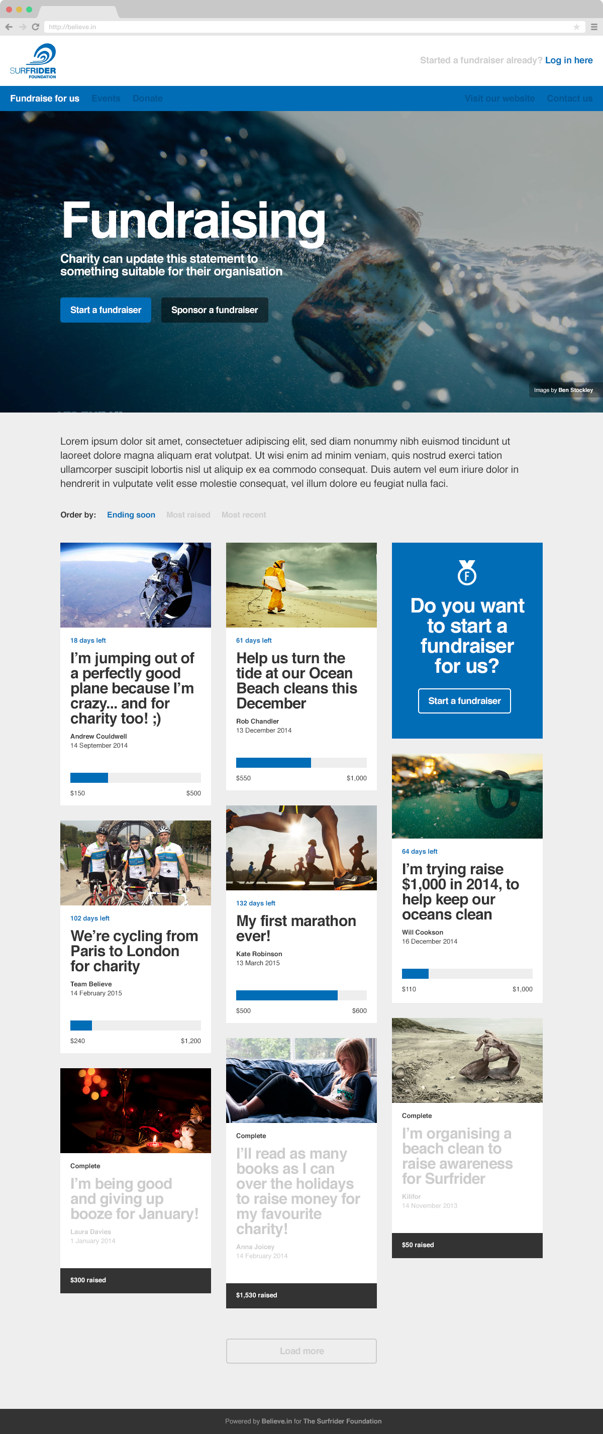
A simple page that showcased all active and completed supporter fundraiser for the charity. It also acted as a landing page for charities to send interested fundraisers too, to start their own fundraiser.
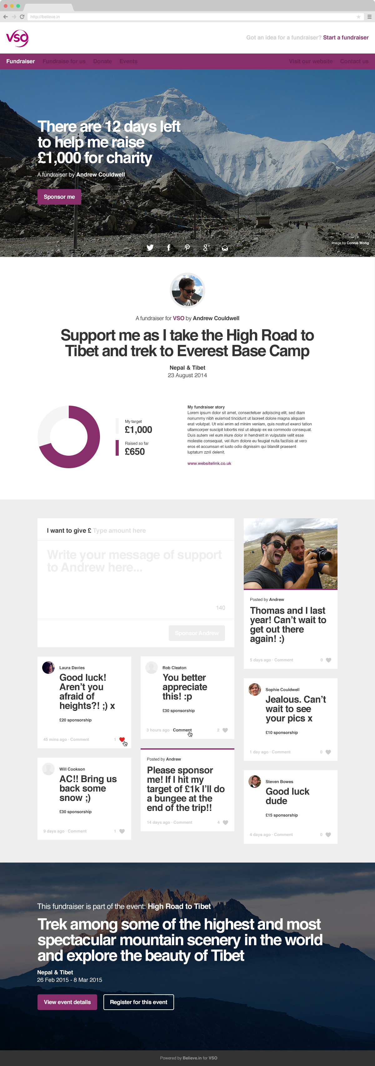
We made it easy for non-profit supporters to setup their own, unique and beautiful online fundraiser pages. At it's simplest, the supporter would enter their basic details, choose a photo from a stock gallery, easily share their page and start collecting donations in literally minutes. The page kept track of your fundraiser progress towards it's target, set by the fundraiser. The more creative users could personalise their page with their own images and story of why they were supporting the charity.
The concept of tiles, for the user to track the progress, add a back story, or post images/updates pre, during or post fundraiser — was something we sadly never launched, during this stage of the product development. But was a continuation of our previous social platform product.
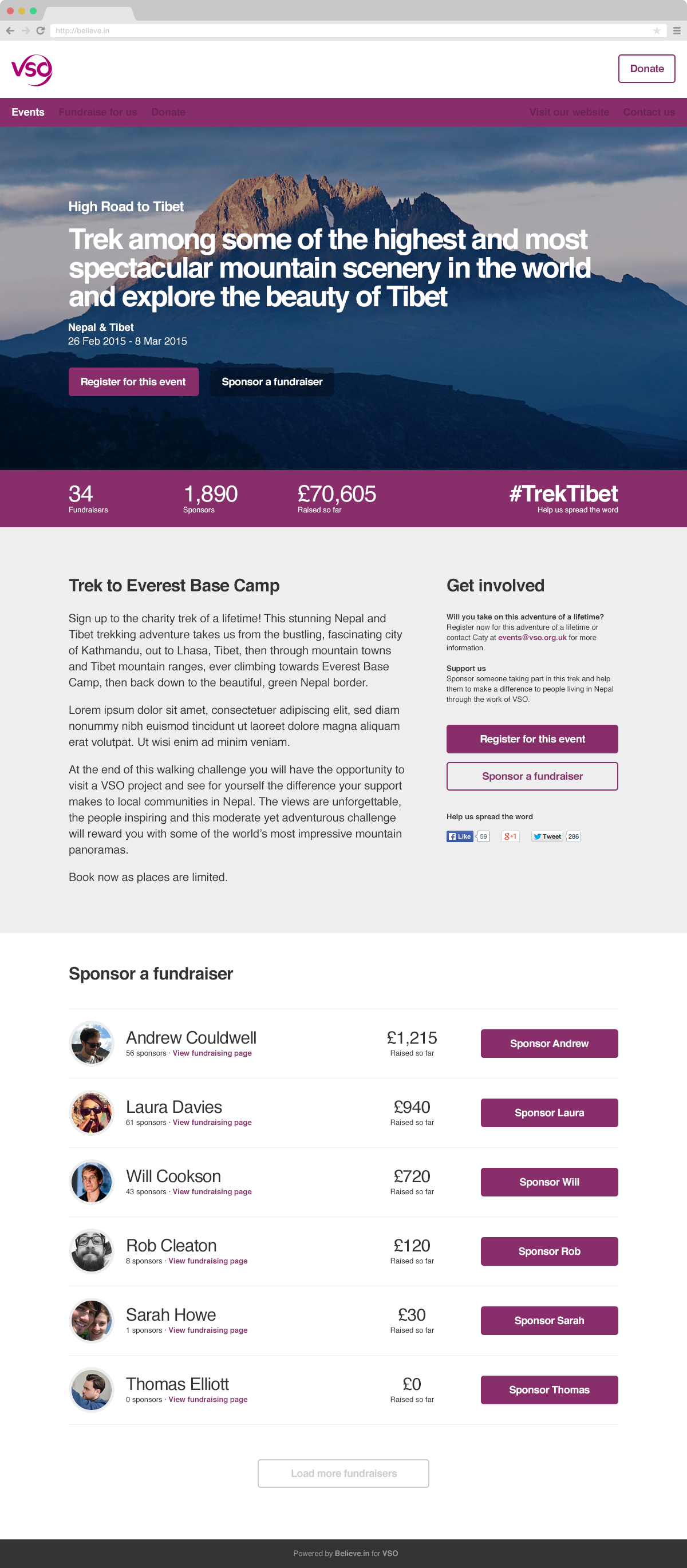
An event centered around fundraisers — introduced the event/initiative, allowed supporters to simply create their own fundraiser page, and most importantly featured a leaderboard of all participating fundraisers. This simple gamification was great incentive to encourage fundraising, while also championing the generosity of their supporters.
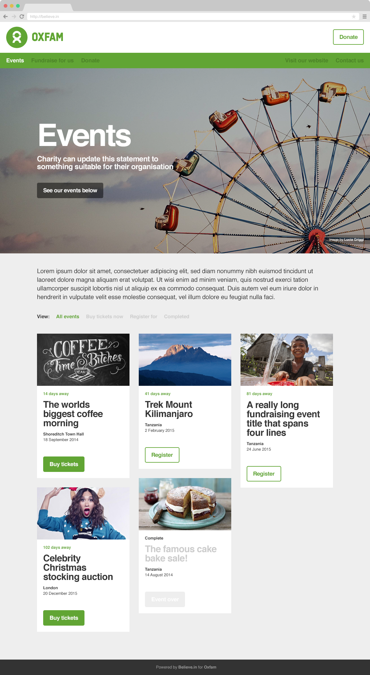
A place to showcase all upcoming and past events. The charity could create events that encouraged supporters to start fundraisers, or purchase tickets, or simply register their interest.
An alternative to the previous events template, with a horizontal scroll area for the different events.
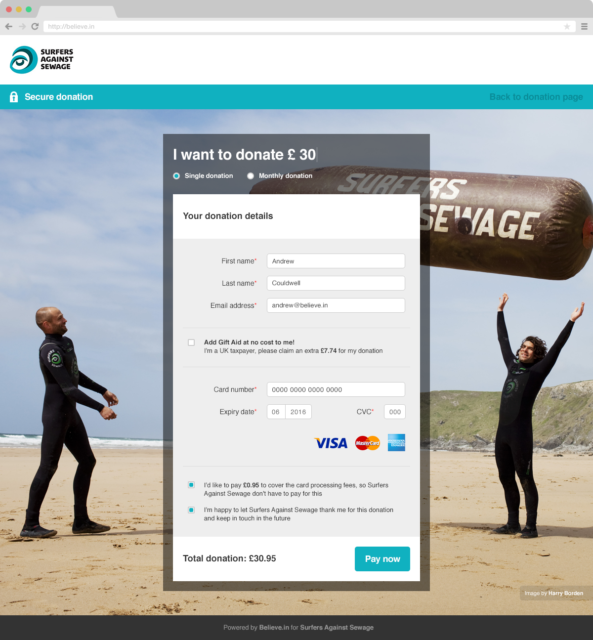
A very simple checkout process, powered by Stripe. We were one of the first companies in Europe to pioneer this payment processor. The charity could add their own background image. These checkout pages were built so they could be used with all our tools, or work seamlessly with their external websites, for powering all and any donations — and as it's white-label, the process worked brilliantly, as charities like The Big Issue Foundation in the UK discovered.
A key feature of our checkout was the option for the user to pay for the card processing fees all online payments are subject to, thus saving the charity money.