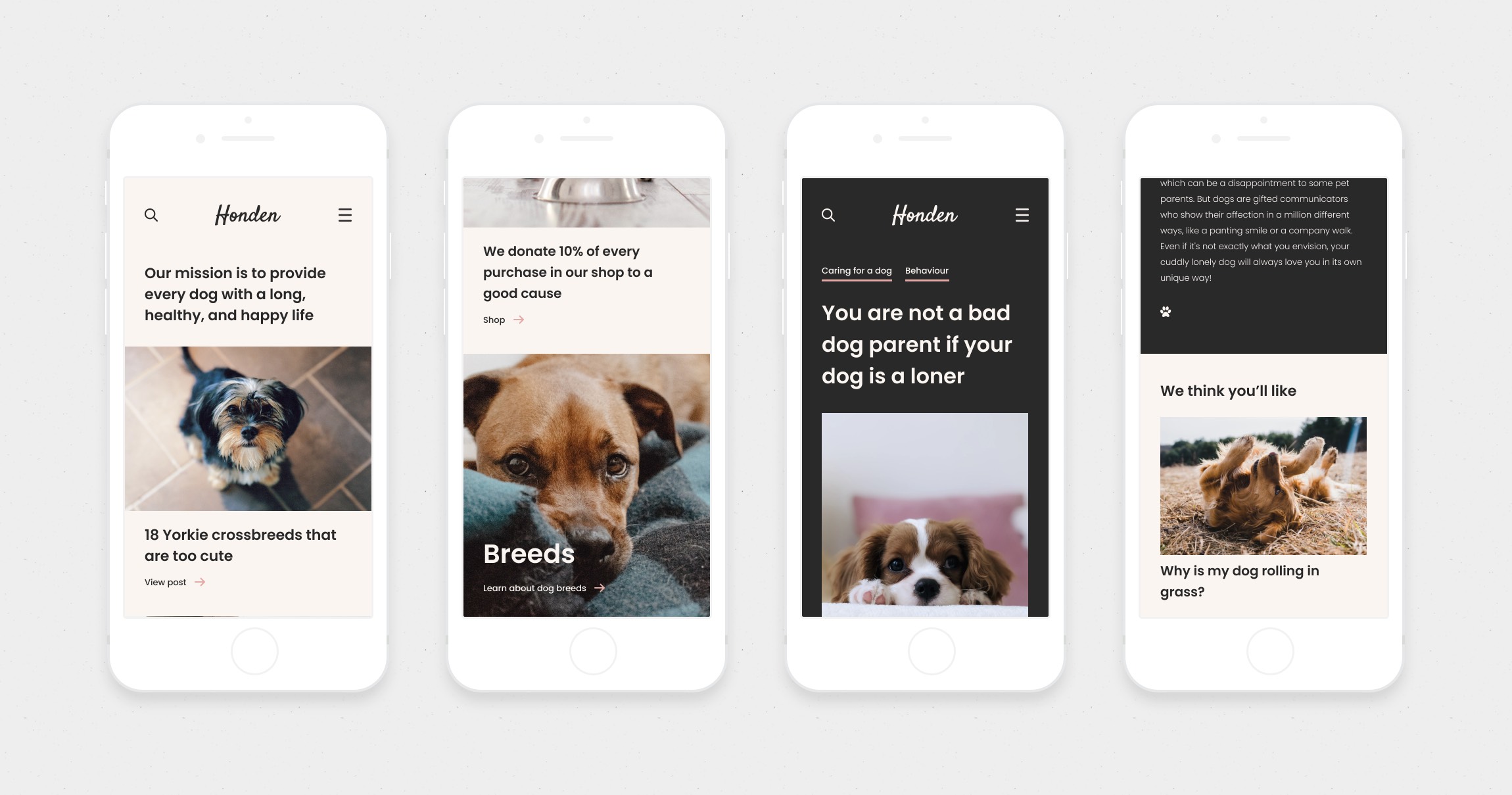
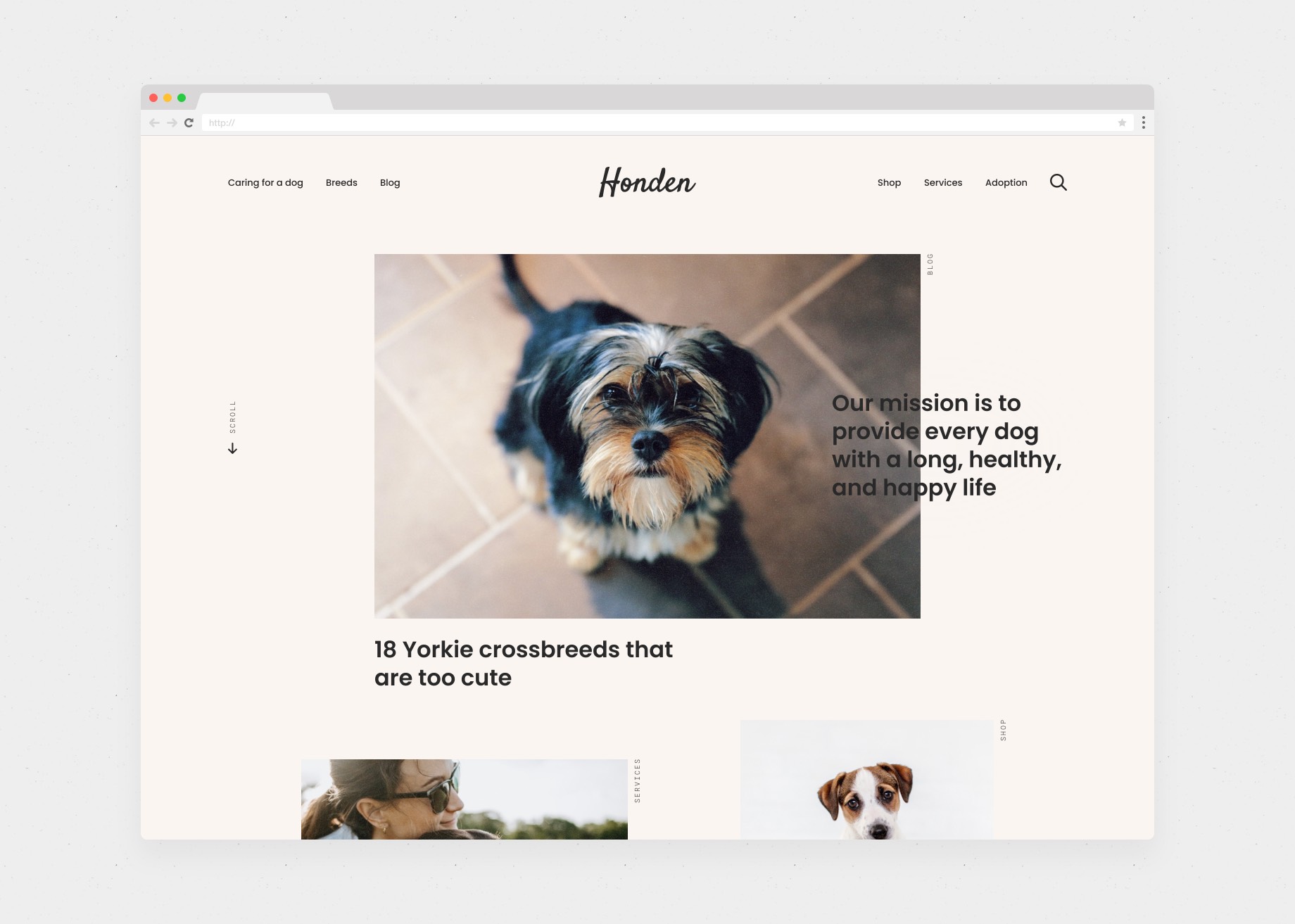
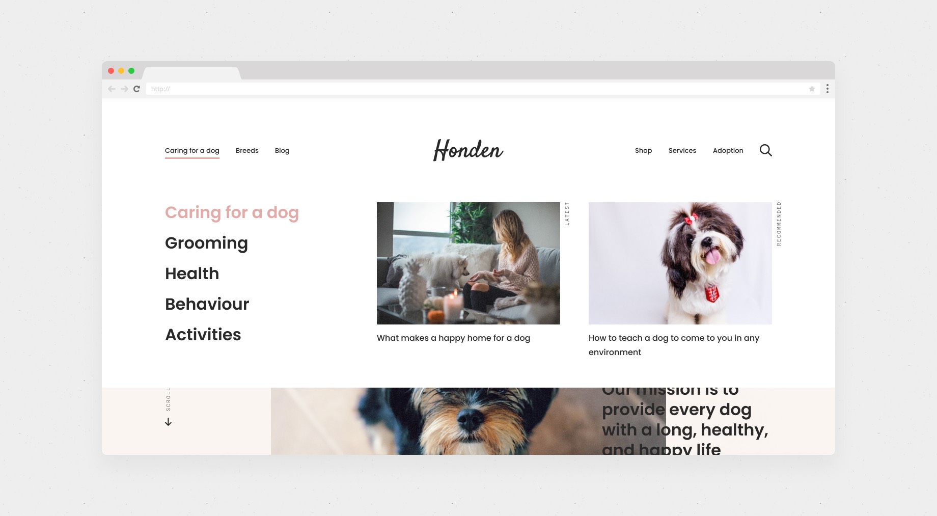
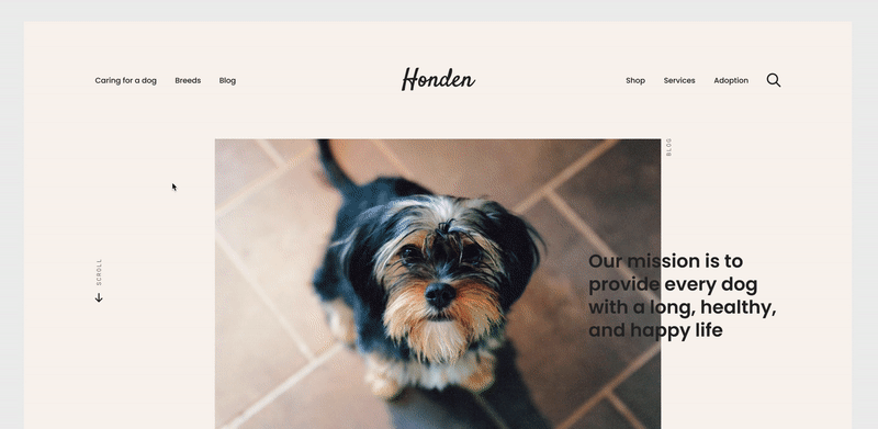
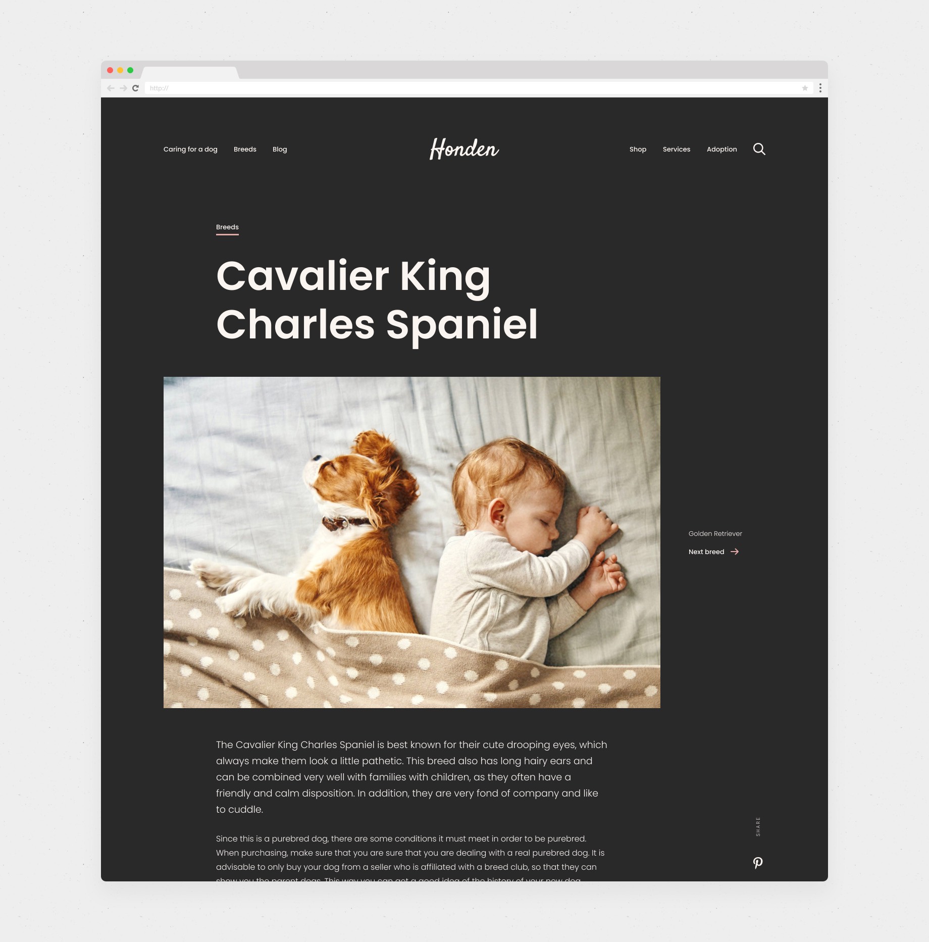
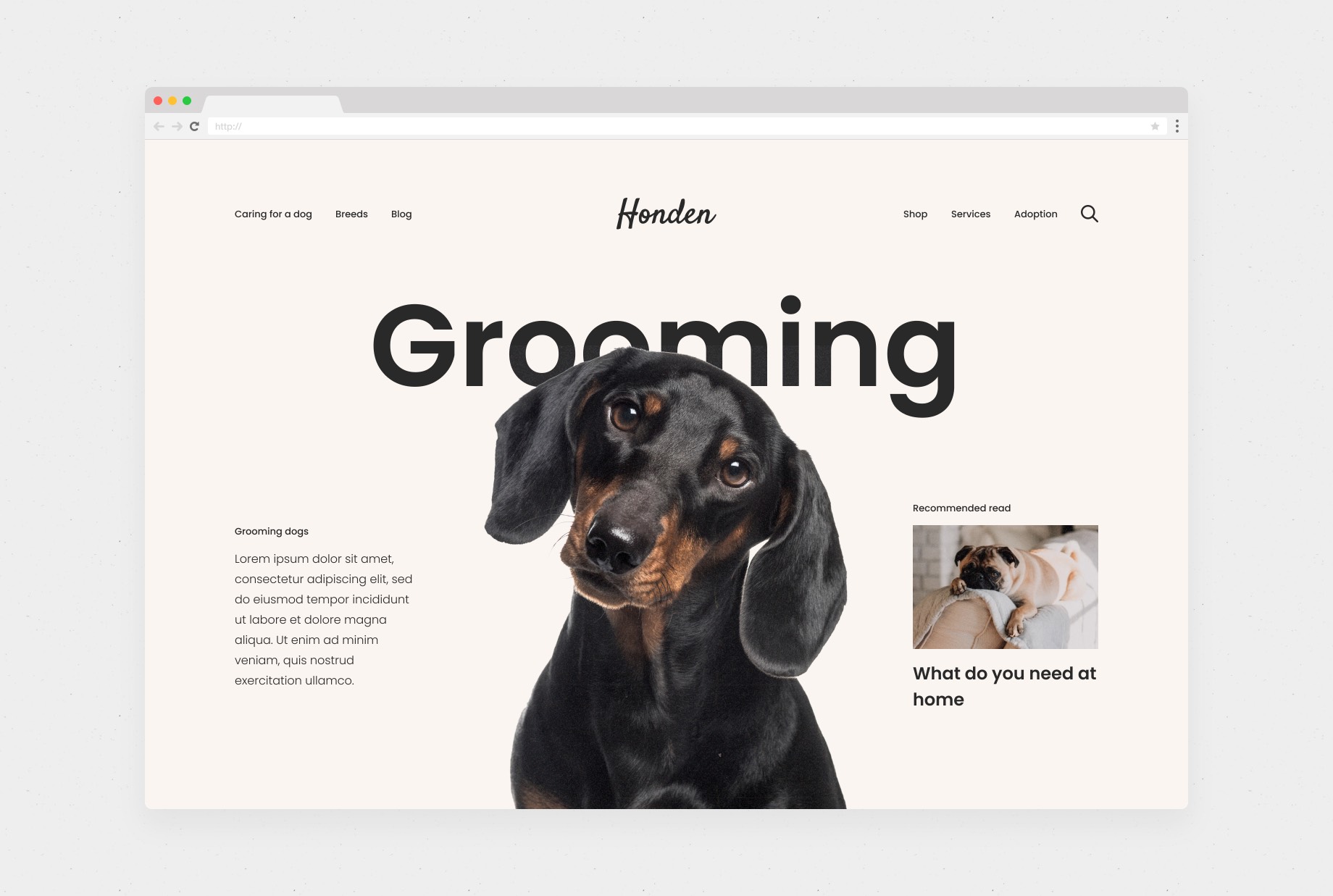
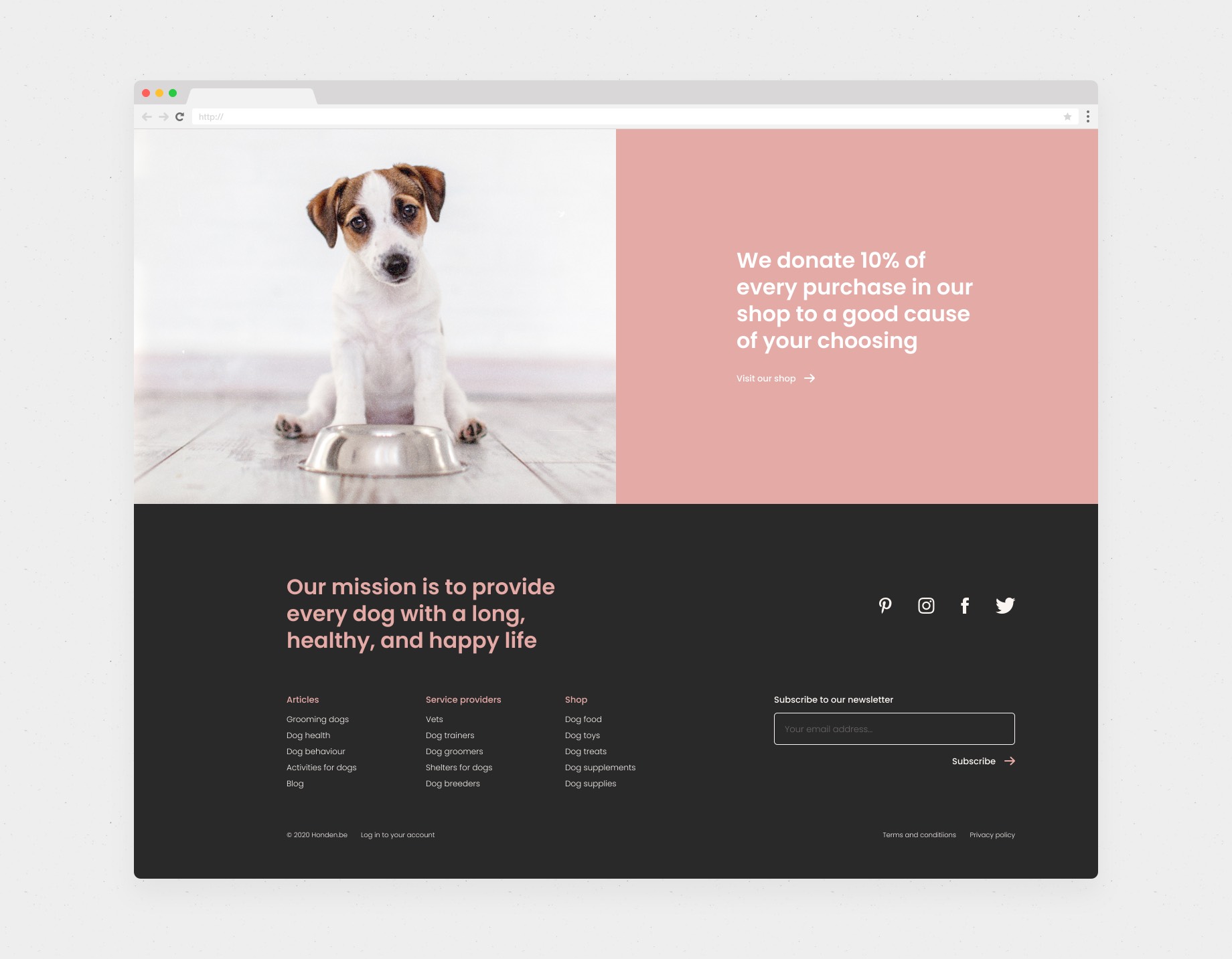
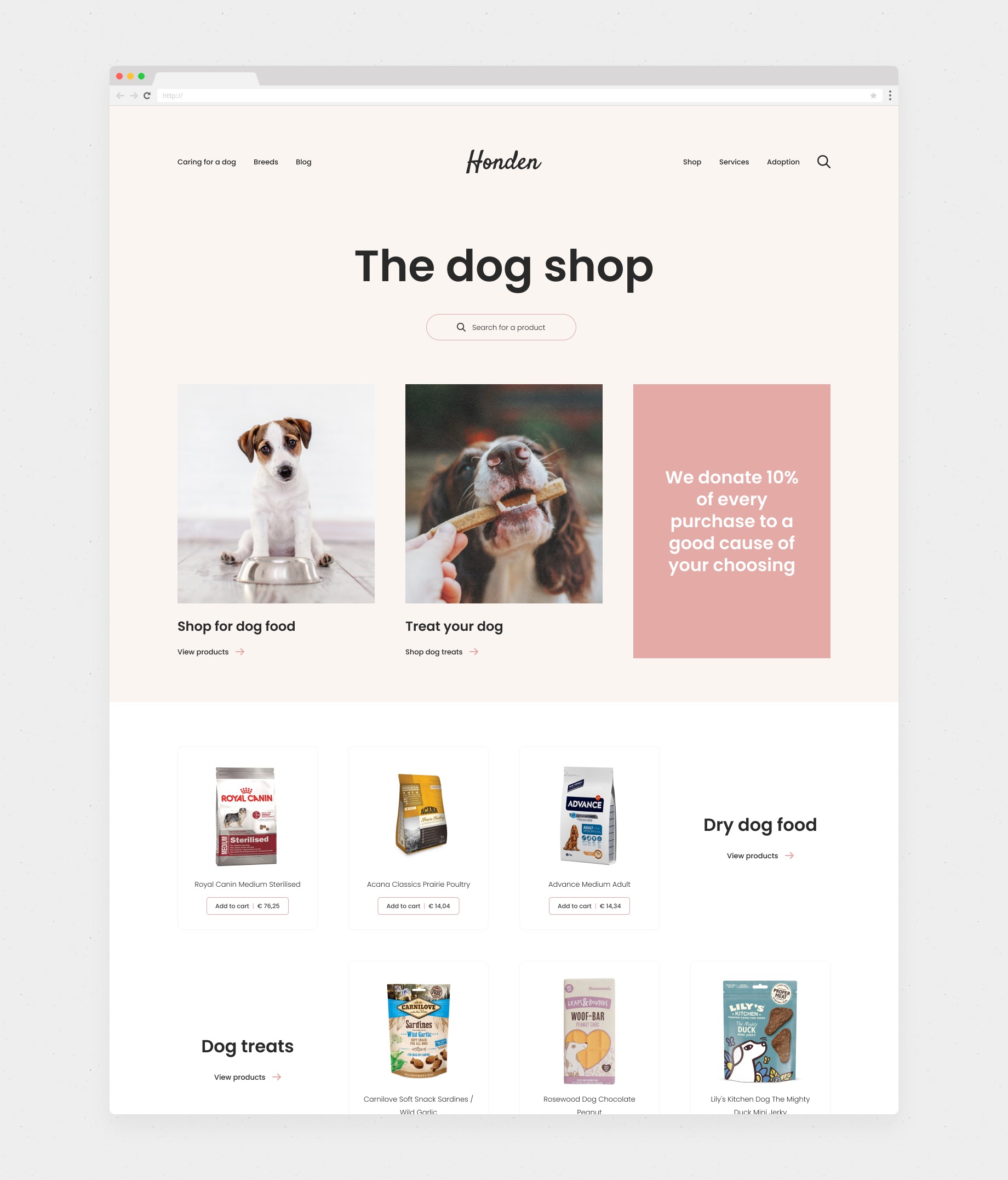
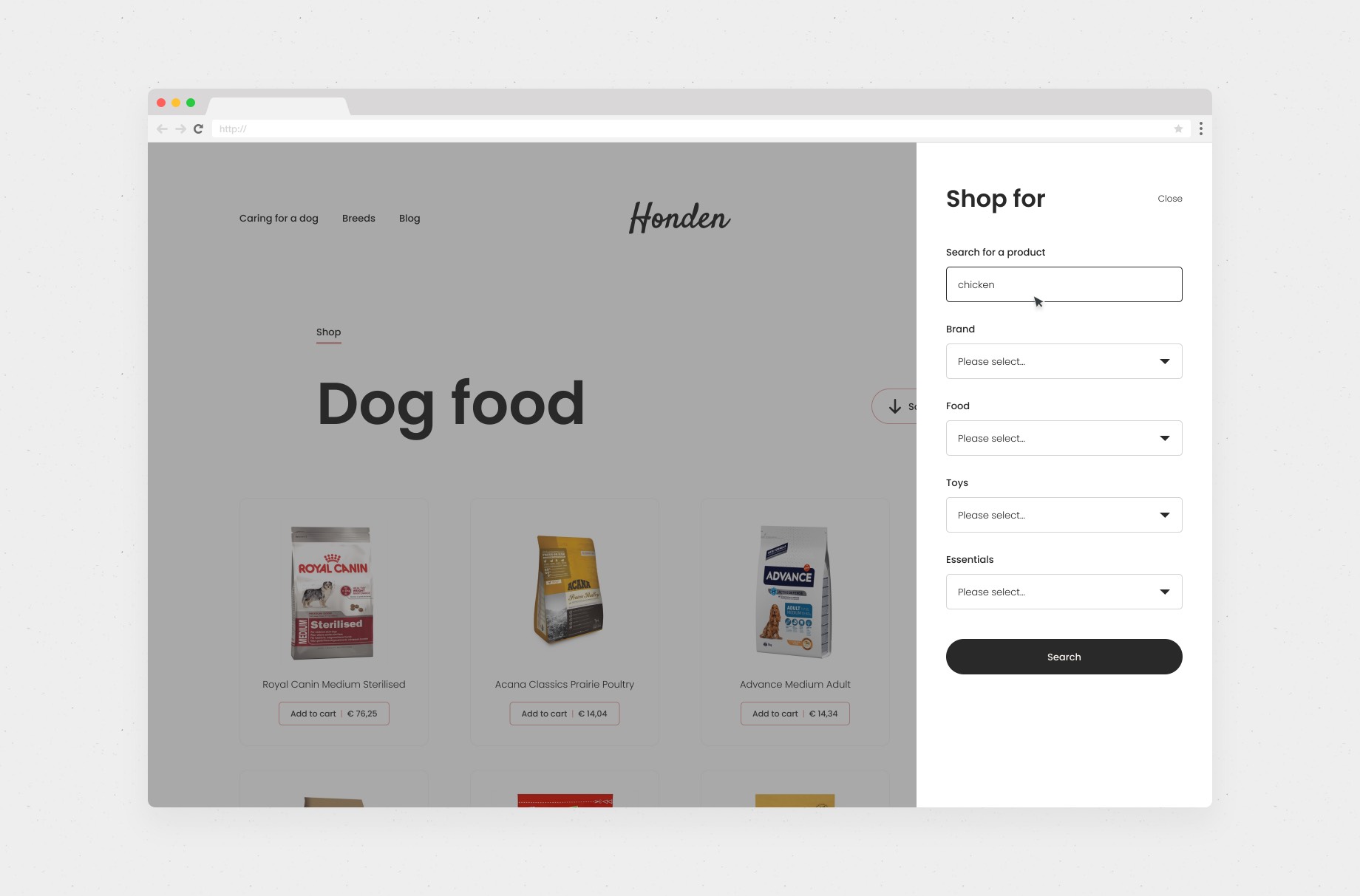
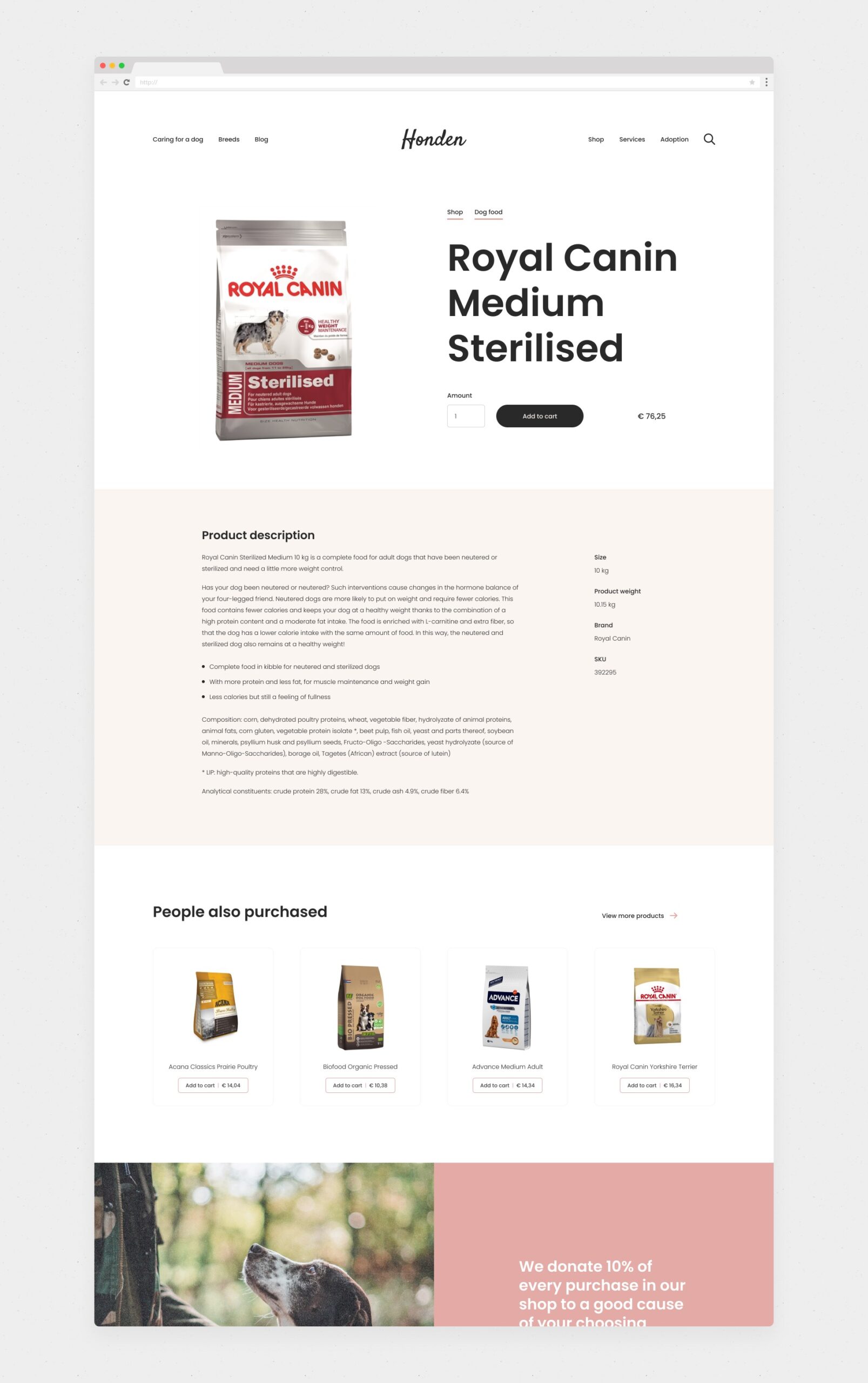
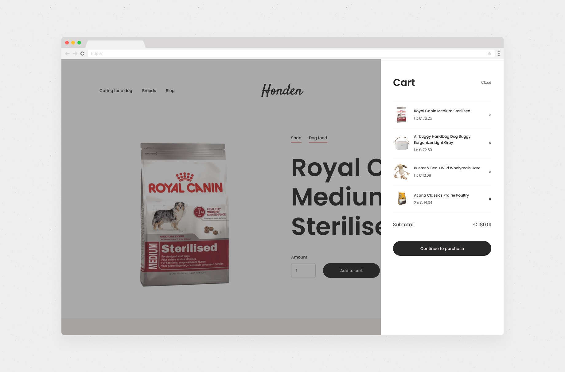
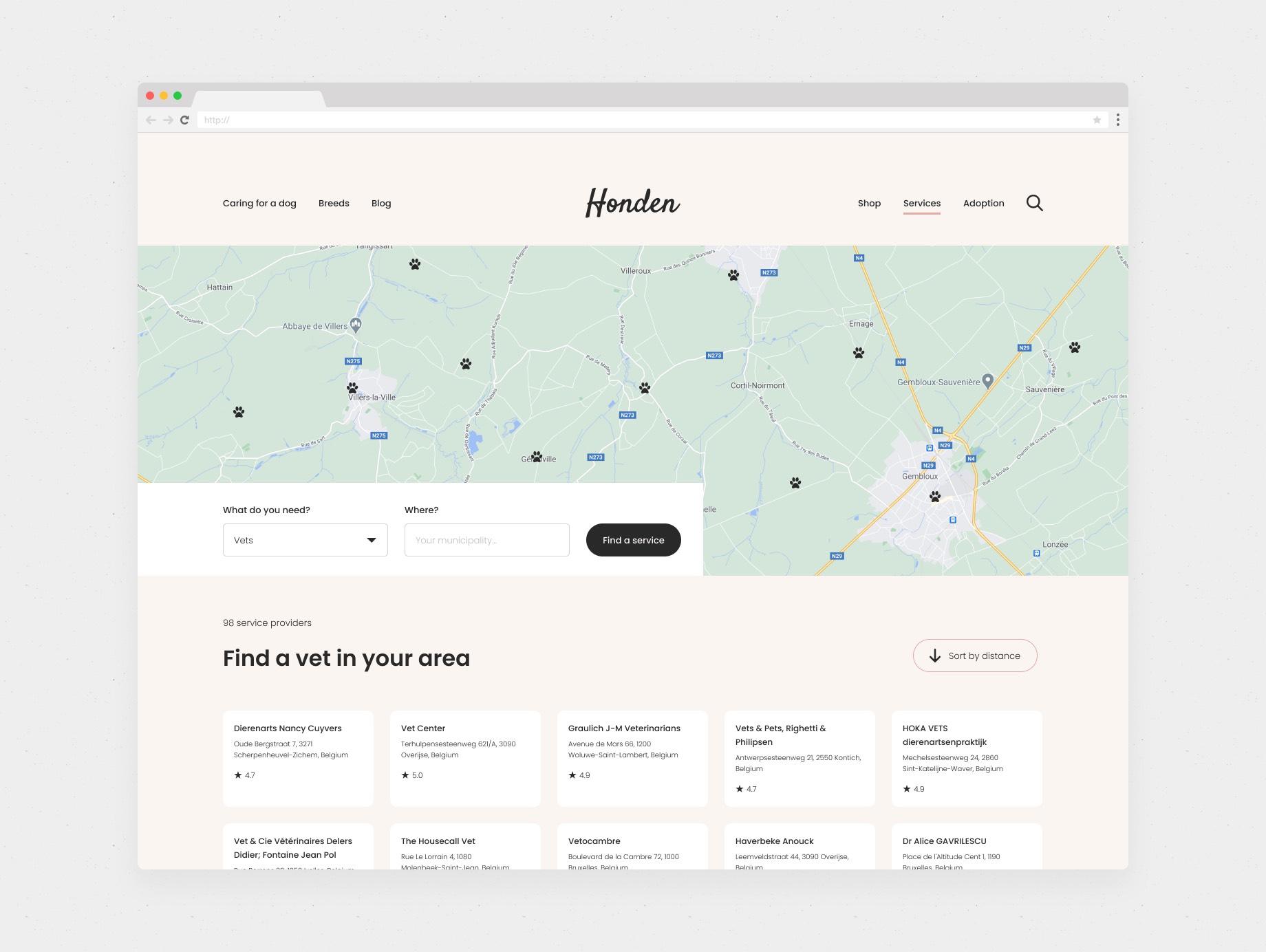
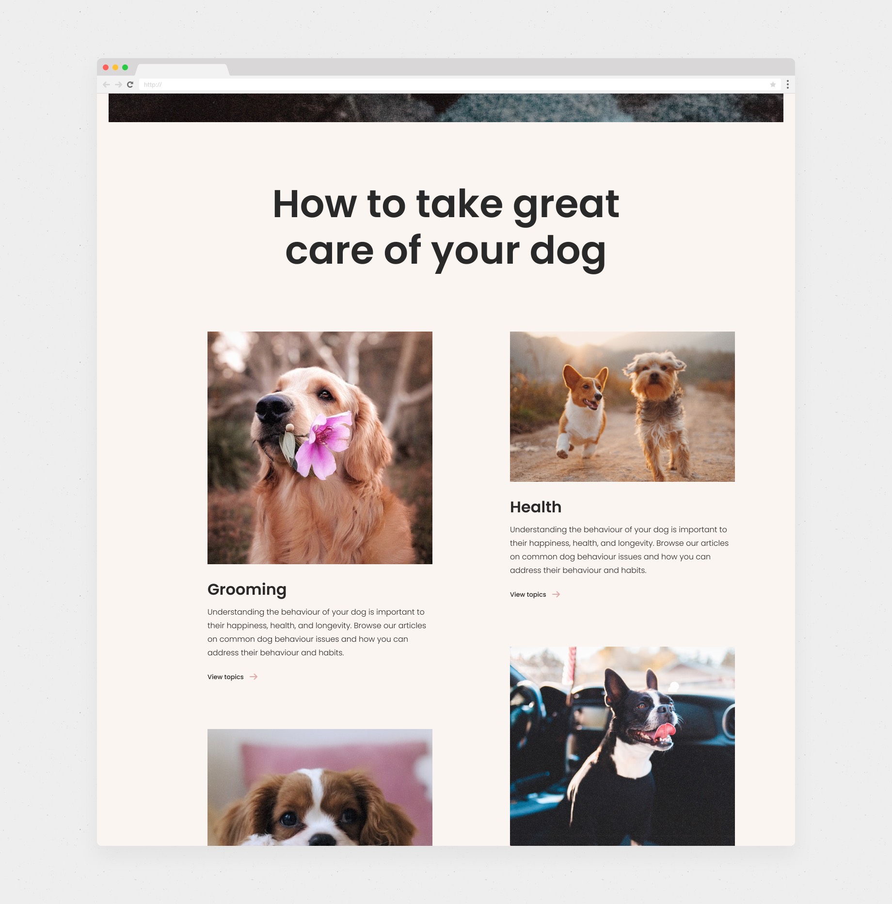
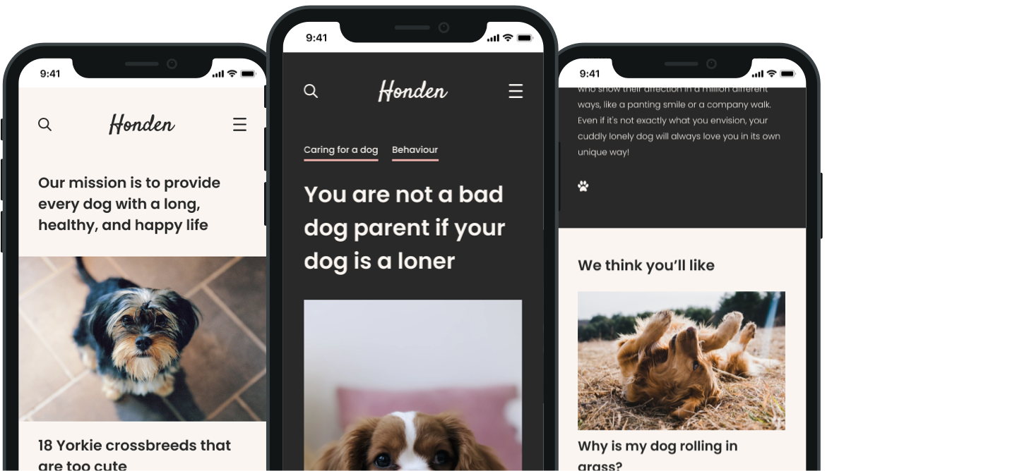
Honden is German for dog! This Belgium-based company hired me to design a logo, brand, and responsive website. Their business was revolved around all things dog! Their website features editorial content, a means of finding dog-related services in your area (e.g. vet, grooming, adoption), a shop to buy everything from food to toys and beds, and all sorts of SEO-driven content like information on different dog breeds.
With such a visually rich subject matter, I set out to create a fun, bold, and unexpected brand and website experience. The client wanted to be distinctive, memorable, and something people would enjoy coming back to (and sharing!). The brand is clean and contemporary, and the website is bold and beautiful, mixing bold typography with interesting animations, lots of whitespace, and stunning (and cute!) photography of dogs.
Creative direction
Brand design
Web Design
Dec 2020 - Jan 2021
I wasn't as worried about maximising screen estate as much as I am in other projects (i.e. more above the fold). A lot of this content was cross-selling into more content — more for retention than anything, directing people to key areas of the site. The more eye-catching the better.
I experimented with a global navigation that highlighted the main areas of the business and content, in a visually compelling way that was fun to navigate.
This was one of my favourite template designs. The user spends more or less time on certain web pages. The home and category pages, for example, predominantly act as a gateway to other content. An article template is different. The intention is the user will spend more time on this page — to sit and read. I created a dark mode-inspired template that would be easy on the eye (in any light), with the added bonus of it being another distinctive aspect of the brand. A visually interesting transition between the pages you navigate.
A category page (for article content) is often a very templated page of thumbnails. With such an interesting (and cute!) visual subject, it just felt right to cut out dogs and overlay them on the category name! I'd come back to this page again!
The minimal aesthetic of the website continues into the e-commerce parts of the website. Removing the clutter shoppers are used to seeing (e.g. on Amazon) — focussing on the products and helping the user find what they need.