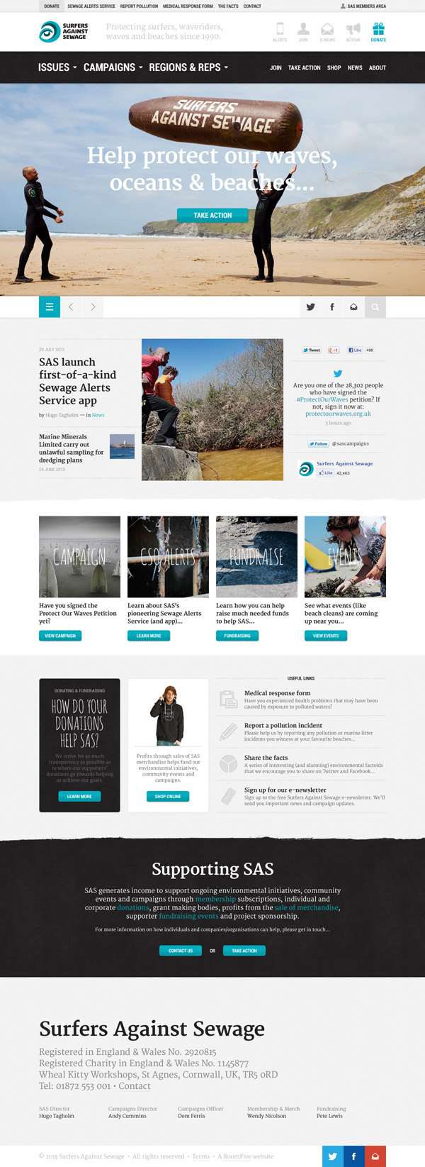
Home page
The design of this site was very much led by the wireframes. A solid UX & UI foundation had been laid out to cover all campaign areas, content types and scenarios… Some graphic designers will hate to read this, but the Photoshop 'stage' was more or less 'colouring in' ;)
Photography
Surfers Against Sewage have an amazing group of supporters and Reps including various other creatives. Fortunately SAS already had a massive archive of photos to select from, but a further photography brief was created to get shots specifically for the new website. Photographer Andy Hughes did a great job capturing some of SAS's various campaign areas in and around Cornwall. Photographer Chris McClean later added some amazing shots from an official SAS Reps weekend (and beach clean) in Devon, plus more shots from the North East of England. These shots, along with several other contributing photographers' all massively contributed to the aesthetic of the website.
Social
The navigation and social media was led by the previous/ongoing success of elements of the Protect Our Waves petition website I'd previously done for SAS. There are various means of sharing content throughout the site, with bespoke campaign messaging over Twitter, Facebook and email.
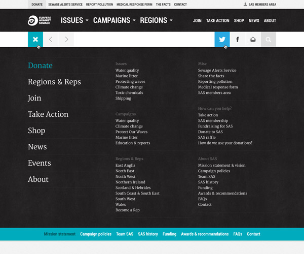
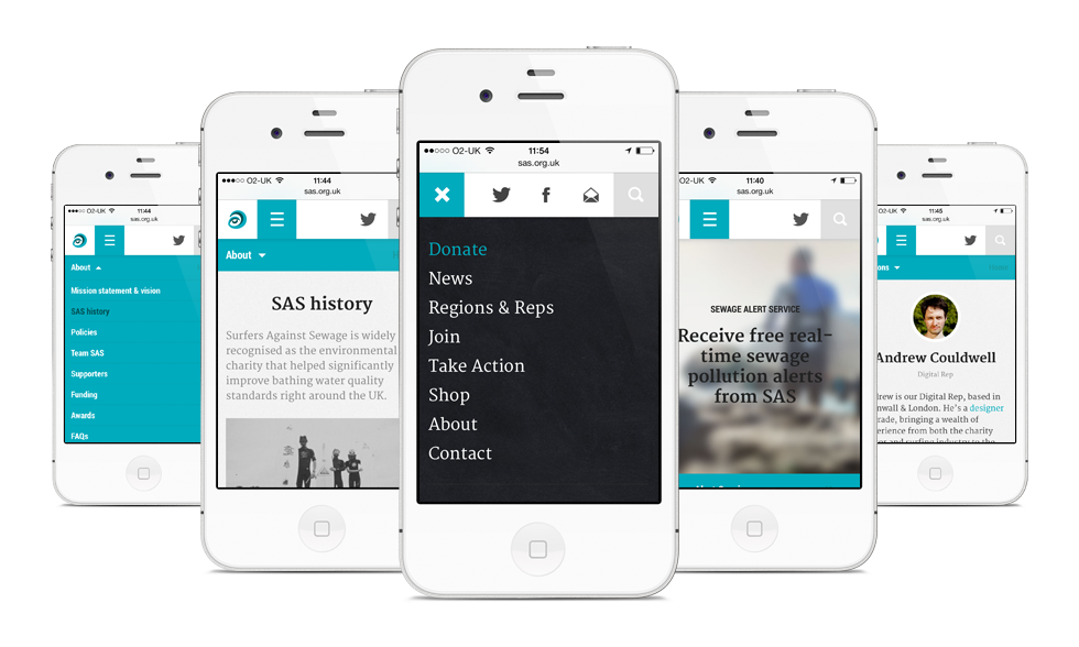
Global navigation
There are a few tiers of navigation, so everything is easily accessible from anywhere on the website. The 'global navigation' (seen open/active here) is accessed via a simple tab and is universal across all devices, essentially acting as a sitemap to the main sections, highlighting and grouping key areas for quick access.
The 'global navigation' is a useful feature for the desktop site (to supprt the primary, secondary and tertiary navigations), but is the primary/core navigation on mobile devices.
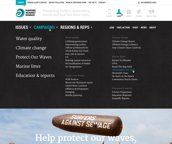
Primary navigation
The main navigation for the desktop site. The charities operations are broken down into three key areas — the issues they combat, their campaigns and regions (regional environmental info & Regional Reps). Via a simple accordion menu system the three areas are easily explored and grouped accordingly.
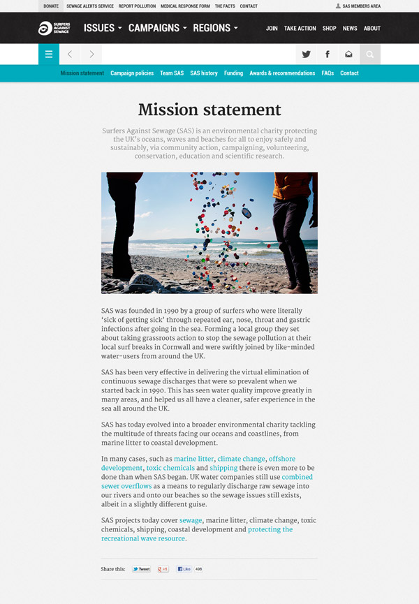
Text pages
Bodies of text (generally) on the website are centered on the page in a narrow column, distraction and clutter free, so the user can focus in on and read the content, with no unneccesary fuss or annoying adverts & cross-sells.
Typography
Large, clean and clear throughout the site.
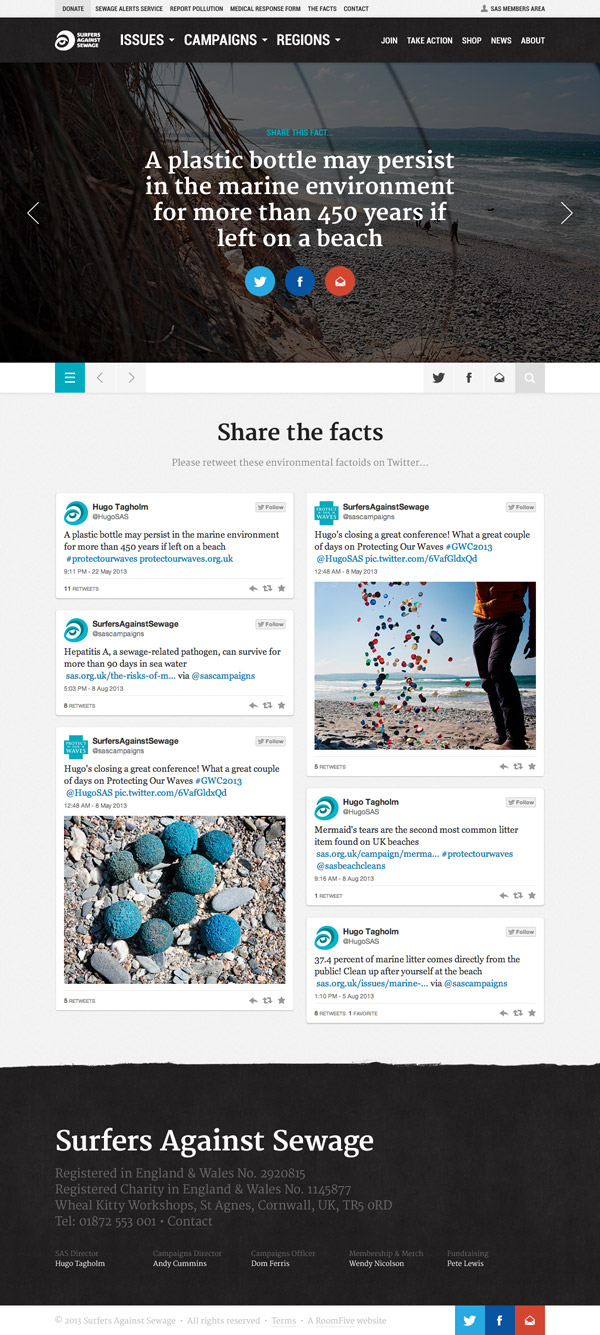
Share the facts
An innovative feature highlighting a series of shareable marine and coastal environmental factoids designed to get a reaction and be shared over Twitter, Facebook and email.
Share the facts now at: www.sas.org.uk/share-the-facts/
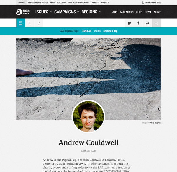
Team & Rep profiles
Personalised profile pages introducing the charities supporters to their Regional Reps and the core SAS team members, with biographies and contact details.
Yes, that is me in the visual! ;) I'm proud to be the Digital Rep at Surfers Against Sewage, helping them in any way I can across their campaigns on and offline.
You can see my Rep's profile at: www.sas.org.uk/rep/andrew-couldwell/
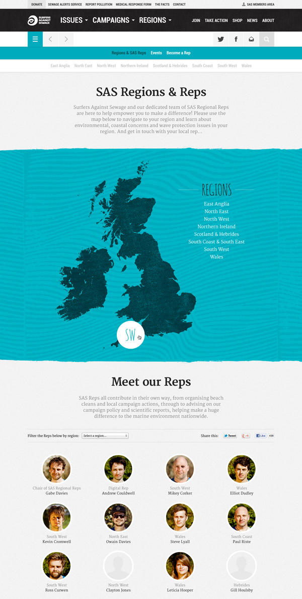
Regions & Reps
This section of the site has information relevant for each region of the UK that SAS operate in. This page is a portal into those regional pages, and it also introduces the user to the charities' Reps from each region. Each region also highlights the local Reps, making it simple to see what's going on in your area and who to contact should you need any help or want to get involved!
Visit this page: www.sas.org.uk/regions-reps/
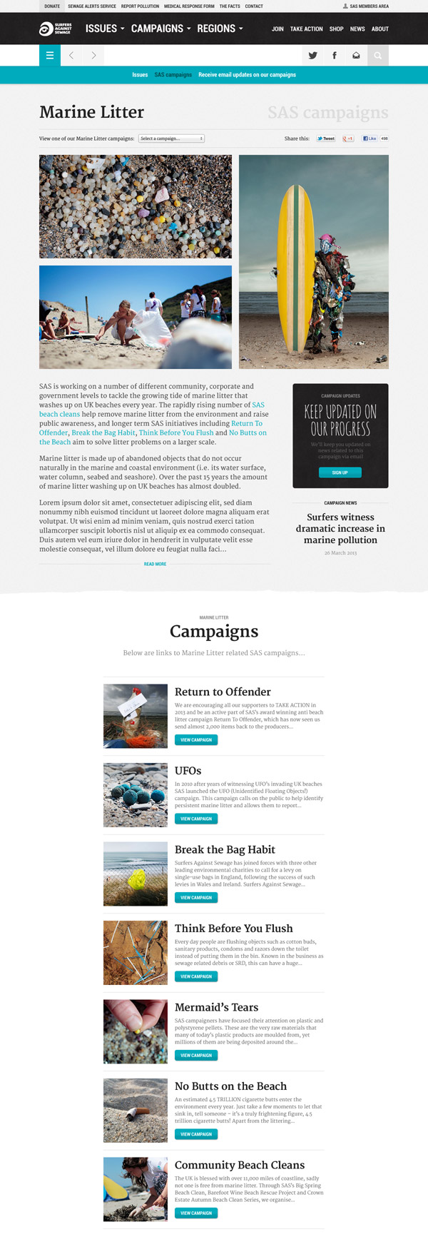
Campaigns overview
SAS's individual campaigns all fall under an overarching campaign area. This template introduces the campaign area(s), linking through to campaigns that focus on each issue (see next template).
Campaign area examples:
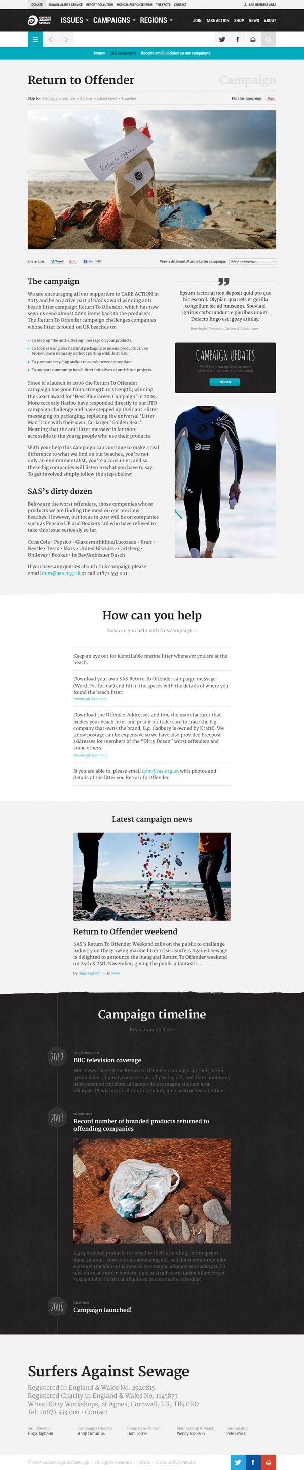
A campaign template
One of the main ideas of this website was for all the main campaign, issue and regional pages to be something someone would be happy to share! A visually led, informative, interesting page that campaigners and supporters alike can easily navigate, share and engage with.
The issue, campaign overview and campaign templates are all very similar, with a few tweaks to differentiate and focus in on different elements, like information, specific campaign (latest) news, timeline of events, how you can help/get involved (take action!), prompts to share etc…
Campaign examples:
- Return to Offender
- Mermaids Tears
- Beach cleans
- Combined sewage overflows
- Sewage and sickness
- UFOs
- Protect Our Waves Petition
- Schools programme
- Think Before You Flush
Issue examples:
Issues are more about information and presenting facts and case studies, which all lead into the campaigns…
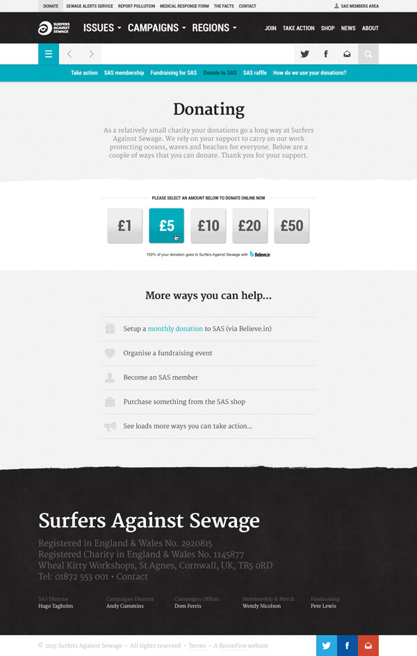
Donating
The donations are handled off-site on the new social platform for charities: Believe.in where no cuts are taken off donations, unlike JustGiving & Co.
The donation amounts in the design feed into a pre-populated form on the charities unique/styled page on Believe.in, so is super quick and easy to donate online.
Follow SAS on Believe.in at: https://believe.in/surfers-against-sewage/
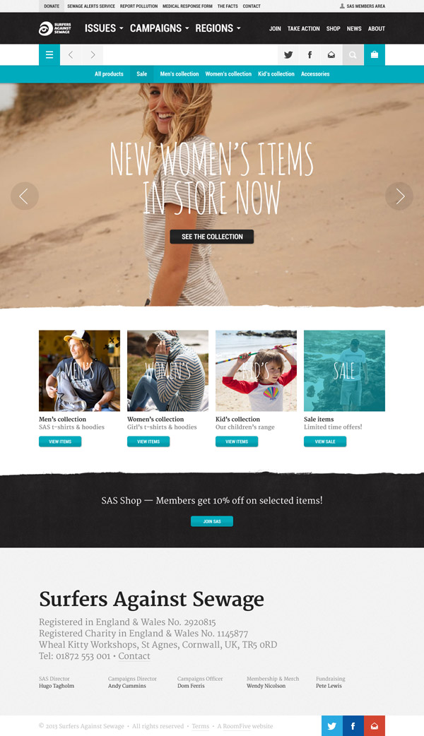
Shop (home)
Introducing a fashion/lifestyle element to the charity, presenting the official charity merchandise in the best light, in harmony with the natural coastal/marine environment they campaign to protect.
Note: The images used in the design mockup to the left are for creative direction only. The header image is from the Finisterre lookbook, the small thumbnails are sourced from SAS, Finisterre and Quiksilver.
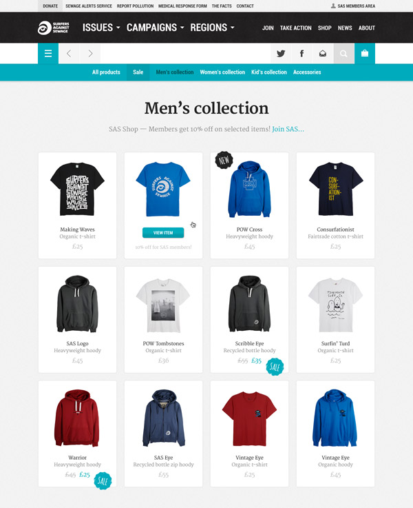
Collection (shop products)
The product tiles flip 180° on mouse rollover to show the reverse of each product, as most of the products vary a lot from front-to-back. This also saves the user the trouble of having to visit every product page to see the product in more detail.
View the menswear at: www.sas.org.uk/collection/mens
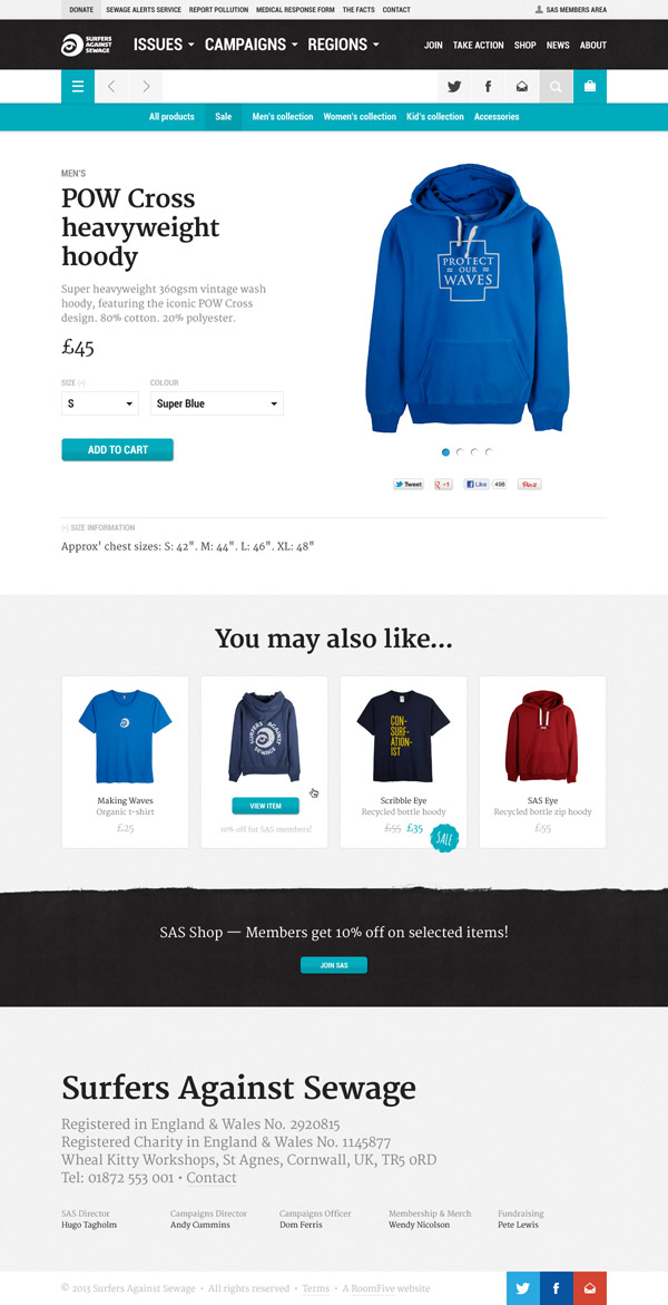
Product page
No fuss. Simple, bold and clear. Let the product (gallery) take the main focus, with clear call-to-actions to select your preferred size, colour and purchase the product.
E-commerce was a problem area with the previous website, the shop was hard to navigate and did little to showcase their products. Since the new website launched, their sales of merchandise has dramatically increased, as has engagement across the website!
Product examples:
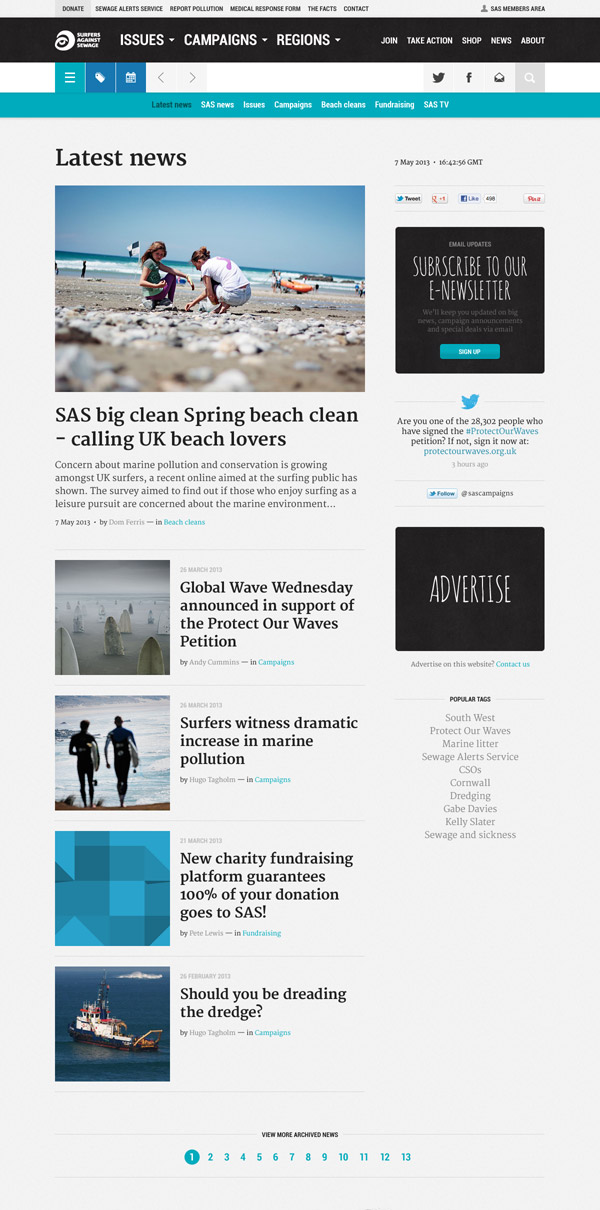
Latest news
I wanted to do something a little different with the main news area… I went for a more editorial/newspaper feel, highlighting the latest news story as a main focus point, then presenting the latest few headlines below that, as opposed to presenting the user with a mass archive of news, which can still be navigated via the categories, tags and usual blog/methods.
Straying from the 'no-clutter' approach of generic text pages elsewhere on the website, it was important to SAS that the news section had opportunities to run advert banners to generate more income from charity sponsors/supporters… So I mixed ad banners in with sign-ups for e-newsletters, latest tweet and popular tags (links).
See their latest headlines: www.sas.org.uk/latest-news/
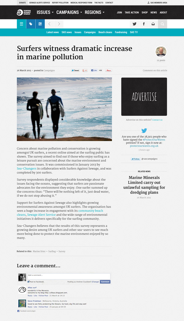
News article/post
Simple and clear.